Cart Sidebar
The Cart Sidebar section displays a slide-in cart panel on all pages except the dedicated cart page. To enable it, go to Shopify Admin → Themes → Customize → Theme Settings → Cart and set Cart type = Sidebar.
Section structure

Settings
Background & Text

- Background: Solid or gradient background color for the sidebar.
- Text color: Global text color, selected from Theme Settings → Basic Settings → Colors.
Cart header
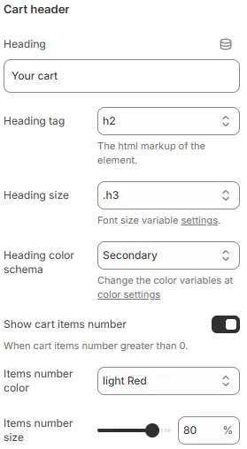
- Heading: Sets the visible title text for the cart header section (e.g., “Your cart”). This is user-editable and appears as the main label above cart contents.
- Heading tag: Defines the HTML semantic tag used for the heading element (e.g.,
h2,h3,h4). Affects SEO structure and default browser styling; should reflect content hierarchy. - Heading size: Controls the visual font size of the heading via theme-defined CSS variables (e.g.,
.h3). Does not change the HTML tag — only overrides its rendered size for design consistency. Theme Settings → Basic Settings → Typography - Heading color schema: Applies a global color variable (e.g.,
Secondary) to the heading text. Actual color values are managed in the theme’s color settings panel for centralized branding control. Theme Settings → Basic Settings → Colors - Show cart items number: Toggles visibility of the item count badge next to the heading. Only displays when cart contains ≥1 item. Useful for quick user feedback on cart status.
- Items number color: Sets the background or text color of the item count badge (e.g.,
light Red). Allows visual emphasis or brand alignment with notification elements. Theme Settings → Basic Settings → Colors - Items number size: Adjusts the scale of the item count badge using a percentage slider (default: 80%). Larger values increase badge prominence; smaller values reduce visual weight relative to heading.
Cart Body
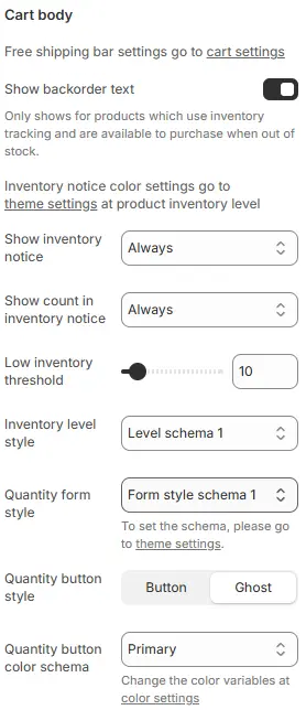
- Displays cart items and optional free shipping progress bar (configured in Theme Settings → Cart → Free shipping bar).
- Show backorder text: Toggles visibility of a message indicating that out-of-stock items can still be ordered (backordered). Only appears for products with inventory tracking enabled and set to allow backorders. Helps manage customer expectations during stockouts.
- Show inventory notice: Controls when an inventory status notice (e.g., “In Stock”, “Low Stock”) is displayed. Options:
Always— shows regardless of stock levelWhen inventory low— only when below thresholdNever— hides all inventory notices
- Show count in inventory notice: Determines whether the actual remaining quantity (e.g., “5 left”) is shown alongside the inventory notice. Options mirror “Show inventory notice” — useful for transparency or urgency messaging.
- Low inventory threshold: Sets the numeric value (default:
10) at which the system considers stock “low”. Triggers conditional UI elements like warnings, color changes, or hidden buttons if configured elsewhere. - Inventory level style: Applies a predefined visual schema (e.g.,
Level schema 1) to how inventory levels are presented — may include icons, colors, progress bars, or text styles. Managed globally in theme settings for consistency. Theme Settings → Style scheme settings → Inventory Level Style Schema - Quantity form style: Defines the appearance of the product quantity input field in the cart (e.g., dropdown, stepper, plain number box). Schema options (like
Form style schema 1) control layout and interaction patterns — configure via theme settings. - Quantity button style: Chooses between two visual treatments for +/- quantity adjustment buttons:
Button— solid background, prominent click targetGhost— transparent background without border, subtle appearance
Allows UI customization based on design language or accessibility needs. Theme Settings → Basic Settings → Colors
- Quantity button color schema: Applies a global color variable (e.g.,
Primary) to the quantity buttons’ background or text. Actual hues are defined in the theme’s color settings panel for brand alignment and easy updates.
Cart footer

- Background: Sets the background styling for the cart footer (which typically contains subtotal and checkout button).
- Supports solid colors and gradient backgrounds when configured through theme settings or custom code.
- If left unmodified, inherits default footer background from global theme styles.
Announcement Alert
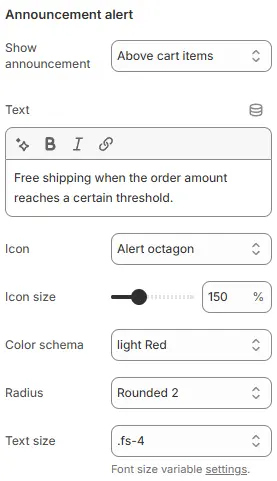
- Show announcement alert:
Above cart itemsDisplay the inventory count at all times, regardless of stock level.Below cart itemsShow the alert immediately after the list of cart items, but before the subtotal and checkout area.Above subtotalPlace the alert just above the subtotal line (and any associated shipping or tax summaries).Below checkout buttonPosition the alert at the very bottom of the cart sidebar, underneath the primary checkout button.HideDo not display notifications
- Text: Alert message content.
- Icon: Optional prefix icon.
- Icon size: Icon scale as percentage.
- Color schema: From Theme Settings → Basic Settings → Colors.
- Radius: Defines the corner rounding of the announcement container.
- Text size: Font size from Theme Settings → Basic Settings → Typography.
Empty Cart
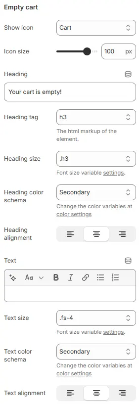
- Show icon: Selects the visual symbol displayed when the cart is empty.
- Current selection:
Cart— a generic shopping cart icon to reinforce context. - Other options may include “Empty box”, “Sad face”, or custom SVGs depending on theme.
- Current selection:
- Icon size: Controls the display dimensions of the empty cart icon in pixels (default:
100 px). Adjustable via slider for visual balance with heading and text content. - Heading: The main title shown when cart is empty (e.g., “Your cart is empty!”). Fully editable to match brand voice — can be playful, direct, or instructional.
- Heading tag: Defines the HTML semantic element used for the heading (e.g.,
h3,h4). Affects accessibility and SEO structure; should reflect document hierarchy. - Heading size: Sets the rendered font size using theme-defined CSS variables (e.g.,
.h3). Does not change the HTML tag — only overrides its visual scale for design consistency. - Heading color schema: Applies a global color variable (e.g.,
Secondary) to the heading text. Actual hues are managed in theme’s color settings panel for centralized branding control. - Heading alignment: Chooses horizontal alignment of the heading:
- Left | Center | Right
- Default often centered for empty states to draw focus and create visual calm.
- Text: Optional descriptive or call-to-action message below the heading (e.g., “Start shopping to fill your cart!”). Supports rich formatting: bold, italic, links, lists — useful for guiding user behavior.
- Text size: Sets font size of the body text using theme variables (e.g.,
.fs-4). Ensures typographic harmony with other UI elements and responsive scaling. - Text color schema: Applies a global color variable (e.g.,
Secondary) to the body text. Maintains visual consistency across the site while allowing easy updates via theme settings. - Text alignment: Controls horizontal alignment of the body text:
- Left | Center | Right
- Often matched to heading alignment for cohesive layout.
💡 This section defines the entire “empty state” experience — critical for reducing bounce rates and encouraging conversion. Customizable icons, messaging, and styling help turn a dead-end into an opportunity.
Recommended Products

- Displays product recommendations configured in the Featured Products block.
- Position:
Cart item below: Below items (when cart not empty)Empty cart below: Below empty state contentBoth: Show in both contextsHide: Disable entirely
Child Blocks
Cart checkout
Full checkout controls (subtotal, notes, buttons). Settings follow Blocks → Specific Block → Cart Checkout.
Featured products
- Configuration follows Blocks → Function Block → Featured Products.
- Can be hidden if not needed.