Footer
The Footer section appears at the bottom of every page and consists of two main components: a flexible Footer group area (for columns of content) and a fixed Copyright block.
Settings
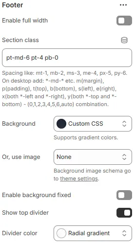
- Enable full width: Expand the footer to 100% of the viewport width.
- Section class: Custom CSS class for the entire footer container.
- Background: Set a solid or gradient background color.
- Or, use image: Apply a background image using a preset from Theme Settings → Style scheme settings → Background Image Schema.
All four settings above follow: Blocks → Overview → General Settings
- Enable background fixed: When toggled on, the footer’s background remains stationary while page content scrolls over it (parallax effect). If off, the background scrolls normally with the page.
- Show top divider: Enables or disables a visual separator line at the top edge of the footer section. Useful for visually distinguishing the footer from main content.
- Divider color: Defines the color treatment of the top divider line. Options include solid colors or gradients (e.g., “Radial gradient”) — actual color values are controlled via theme variables or custom CSS.
Mobile Layout

- Mobile layout: Layout method for mobile devices
Grid: Display all footer columns in a responsive grid.Collapse: Stack columns and allow them to expand/collapse like accordions.
- Show collapse border (only available when Mobile layout = Collapse):
None: No borders shown.All: Borders around both heading and content areas.Left | heading: Vertical border only on the left side of the heading.Left | heading & content: Vertical border on the left of both heading and content.Bottom | heading: Horizontal border below the heading only.Bottom | heading & content: Horizontal border below both heading and content.
- Collapse border color: Border color selected from Theme Settings → Basic Settings → Colors.
- Collapse border radius: Corner roundness for collapsed items (e.g.,
Rounded 1–5,Pill,Circle).
Back-to-top button
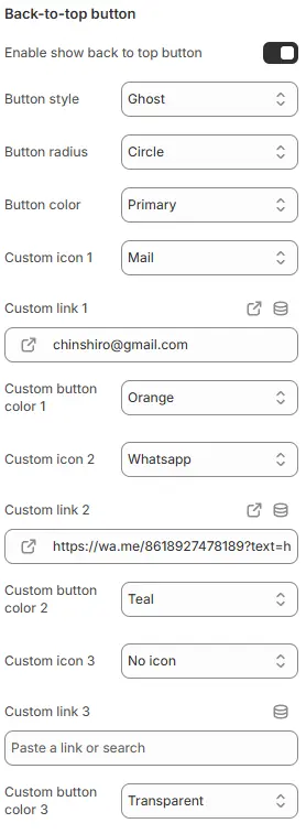
- Enable show back to top button: Toggle the visibility of the floating “Back to Top” button that appears when users scroll down the page.
- Button style: Choose the visual style—
button(solid fill) oroutline(hollow with border). - Button radius: Set the corner roundness of the main “Back to Top” button (e.g.,
Rounded 1–5,Pill,Circle). - Button color: Select the background or border color from Theme Settings → Basic Settings → Colors.
Custom Action Buttons (up to 3) You can add up to three additional floating action buttons alongside the “Back to Top” button.
- Custom icon 1 / 2 / 3: Choose an icon for each button. Select
No iconto hide the button entirely. - Custom link 1 / 2 / 3: Set the destination URL for each button (e.g.,
/contact,https://wa.me/123456789,mailto:support@example.com). - Custom button color 1 / 2 / 3: Assign a color for each button from Theme Settings → Basic Settings → Colors.
💡 Common uses:
- Button 1: WhatsApp chat
- Button 2: Email support
- Button 3: Phone call
All buttons appear as small floating icons on the bottom-right corner of the screen (desktop and mobile).
Supported Child Blocks
💡 Note: Footer only supports sub blocks:
- Footer group : Allow multiple additions and free deletion.
- Copyright : Fixed block, cannot be added or deleted, can be hidden.
Footer Group
A reusable column block for organizing footer content (e.g., links, contact info, newsletter).

Settings
- Block name: Internal name for identification in the Theme Editor sidebar.
- Block width: Column width as a percentage (e.g.,
25%,33.33%). - Show logo: Display your store’s logo at the top of this column.
- Logo height: Logo height in
px. - Enable Follow on Shop: Show Shopify’s “Follow on Shop” button (if enabled in Shopify admin).
Mobile
- Block width:
Half(50% width, two columns per row)Wide(100% width, full-width column)
- Collapsed: Start in collapsed state on mobile (only applies when Mobile layout = Collapse).
Footer Group Child Blocks

Heading
Settings follow Blocks → Basic Block → Heading.
Text
Settings follow Blocks → Basic Block → Text.
Button
Settings follow Blocks → Basic Block → Button.
Currency/Language
Settings follow Blocks → Basic Block → Currency Language.
Navigation
Settings follow Blocks → Basic Block → Navigation.
Newsletter form
Settings follow Blocks → Basic Block → Newsletter Form.
Payment icons
Settings follow Blocks → Basic Block → Payment Icons.
Social media icons
Settings follow Blocks → Basic Block → Social Media Icons.
Copyright
The bottom bar displaying legal and brand information.
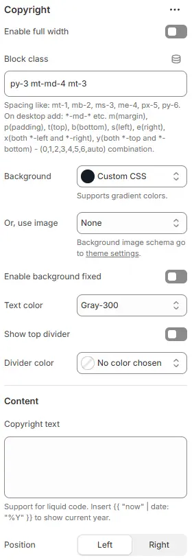
- Enable full width: Expand the copyright bar to 100% width.
- Block class: Custom CSS class for the copyright container.
- Background: Set a solid or gradient background color.
- Or, use image: Apply a background image using a preset from Theme Settings → Style scheme settings → Background Image Schema.
- Enable background fixed: When toggled on, the footer’s background remains stationary while page content scrolls over it (parallax effect). If off, the background scrolls normally with the page.
All settings above follow: Blocks → Overview → General Settings
- Text color: Copyright text color from Theme Settings → Basic Settings → Colors.
- Show divider: Display a top border above the copyright text.
- Divider color: Divider line color from Theme Settings → Basic Settings → Colors.
- Copyright text: Customizable text with Liquid support.
💡 Example:
© {{ "now" | date: "%Y" }} Your Store. All rights reserved. - Position: Text alignment—
leftorright.
Copyright Child Blocks

Currency/Language
Settings follow Blocks → Basic Block → Currency Language.
Social media icons
Settings follow Blocks → Basic Block → Social Media Icons.
Payment icons
Settings follow Blocks → Basic Block → Payment Icons.