Products
The Products section is the main container for the main-product template. It controls the global layout and behavior of the product detail page.
Settings

- Enable full width: Expand the section to 100% of the viewport width.
- Section class: Custom CSS class for the entire product section.
- Enable sticky on scroll: After enabling, Product info block fixed while scrolling.
Breadcrumbs

- Position:
Below page title: Appears under the page’s main headingAbove main content: Shown just before product detailsHide: Disable breadcrumbs entirely
- Link color schema: Text color from Theme Settings → Basic Settings → Colors.
- Alignment: Horizontal alignment (
left,center,right).
Grid layout

- Gap: Set the gap between the Product gallery block, Product info block, and Product detail block.
desktop: Gap on desktopmobile: Gap on mobile (tablet + smartphone)
- Gallery width: Width of the media area as a percentage (e.g.,
50%,60%).
⚠️ Note: Full gallery configuration is managed in the Product gallery child block below.
Sticky 'Add to Cart'
A floating purchase prompt that appears after the user scrolls past the main product content.
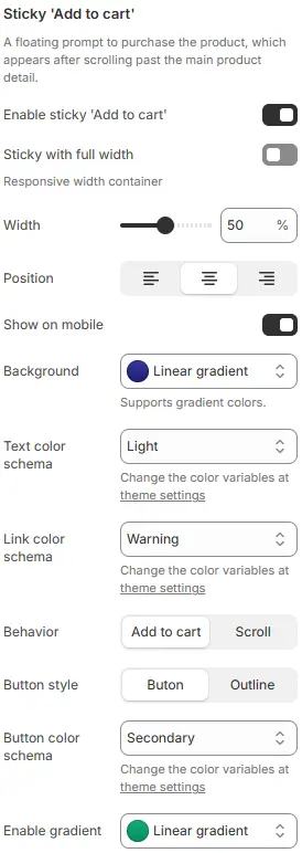
- Enable sticky 'Add to cart': Toggle the sticky bar.
- Sticky with full width: Expand the bar to 100% width.
- Width: Container width as a percentage (when full width is disabled).
- Position: Horizontal alignment (
left,center,right) when width < 100%. - Show on mobile: Display on mobile devices.
- Background: The background color of the entire container supports gradient colors.
- Text color schema: The color of the text inside the entire container.
- Link color schema: Text/link color from Theme Settings → Basic Settings → Colors.
- Behavior:
Add to cart: Immediately adds the selected variant to cartScroll: Smoothly scrolls back to the main “Add to cart” button
- Button style:
Button(solid) orOutline(hollow). - Button color schema: Button color from Theme Settings → Basic Settings → Colors.
- Enable gradient: Customize the color of the button and support gradient colors.
Child Blocks
Page top banner
Controls the inner-page hero banner (title, background, overlay).
Full settings: Blocks → Specific Block → Page Top Banner.
All other blocks
The product page supports the full range of content blocks available in the Blocks → Specific Block → Featured Product composite block, including:
Product Gallery,Card boxTitle,Price,SKU,VendorVariant Picker,Buy ButtonsDescription,Collapsible TabsReviews,Inventory Level,Countdown TimerComplementary/Related ProductsCustom Liquid,Dynamic Source, etc.
💡 You can add, reorder, or customize any of these blocks directly in the Theme Editor to tailor the product experience.