Pop Up
The Pop Up section creates a modal dialog that appears automatically when a page loads. It’s ideal for capturing leads, promoting offers, announcing launches, or displaying important messages (e.g., age verification, shipping delays, or newsletter sign-ups).
Settings
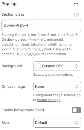
- Section class: Custom CSS class for spacing or layout overrides.
- Background: Set a solid or gradient background color.
- Or, use image: Apply a background image using a preset from Theme Settings → Style scheme settings → Background Image Schema.
- Enable background fixed: When enabled, the announcement bar background remains stationary while the page content scrolls over it (Parallax effect). If disabled, the background scrolls normally with the page.
- Size: Modal width—
small,default,large, orextra large.All four settings above follow: Blocks → Overview → General Settings
Child Blocks
You can include any combination of the following inside the pop-up modal:

Heading
Modal title (e.g., “Get 10% Off Your First Order”). Settings follow Blocks → Basic Block → Heading.
Text
Supporting message or terms. Settings follow Blocks → Basic Block → Text.
Button
Primary action (e.g., “Close” or “Submit”). Settings follow Blocks → Basic Block → Button.
Newsletter form
Email subscription input with Shopify integration. Settings follow Blocks → Basic Block → Newsletter form.
Contact form
Full contact form for inquiries (see Blocks → Basic Block → Contact Form).
Countdown timer
Urgency-driven timer for flash sales. Settings follow Blocks → Basic Block → Countdown timer.
Video
Embedded or self-hosted video content. Settings follow Blocks → Basic Block → Video.
Image
Static promotional or product image. Settings follow Blocks → Basic Block → Image.
3D model
Interactive product visualization. Settings follow Blocks → Basic Block → 3D model.
🌟 Tip: Use pop-ups sparingly and always include a clear close button to avoid frustrating users. For best results, trigger them after a short delay or on exit intent.