Cart
The Cart section is the main container for the main-cart template, used on the dedicated cart page (/cart). It controls the layout and behavior of all cart content, including items, totals, and recommendations.
Settings

- Enable full width: Expand the cart page to 100% of the viewport width.
- Section class: Custom CSS class for the entire product section.
Page header
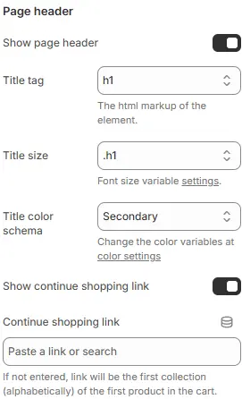
- Show page header: Toggle visibility of the “Cart” heading.
- Title tag: HTML heading tag (
<h1>–<h6>or<div>). - Title size: Font size from Theme Settings → Basic Settings → Typography.
- Title Color Schema: Sets text/background contrast scheme based on global theme colors.
- Continue Shopping Link: Provides users with an easy way to return to previous browsing state — especially useful after viewing a single product or completing a filter action.
Cart Items
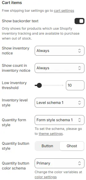
⚠️ Note: Free shipping bar configuration is managed in Theme Settings → Cart.
- Show backorder text: Displays availability notice for out-of-stock items that can still be purchased (requires Shopify inventory tracking).
- Show inventory notice: Toggle low-stock alerts.
- Show count in inventory notice:
NeverDo not display the inventory count.When inventory lowShow the count only when stock falls below the defined low-inventory threshold.AlwaysDisplay the inventory count at all times, regardless of stock level.
- Low inventory threshold: Stock level that triggers “low” status.
- Inventory level style: Styling preset from Theme Settings → Style scheme settings → Inventory Level Style Schema.
- Quantity form style: Quantity form styling preset from Theme Settings → Style scheme settings → Form Style Schema.
- Quantity button style: Quantity button, Button style for increasing or decreasing quantity.
Button:SolidGhost: Hollow Borderless
- Quantity button color schema: Text and border color scheme, also chosen from Theme Settings → Basic Settings → Colors.
Shipping Rates Calculator
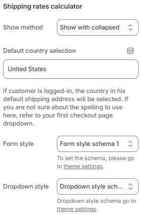
- Show method: Default display mode.
Show with collapsedDisplay the section in a minimized or folded state by default, allowing users to expand it manually. Ideal for saving space while keeping content accessible.Show without collapsedRender the section fully expanded and visible at all times — no toggle or collapse behavior. Best for critical or frequently accessed content.HideCompletely remove the section from view. Use when the feature is irrelevant, disabled, or temporarily unnecessary for the current context.
- Default country selection: Pre-fill with a country code (e.g.,
US,CA). If the customer is logged in, their default shipping address country will override this. - Form style: Styling from Theme Settings → Style scheme settings → Form Style Schema.
- Dropdown style: Menu styling from Theme Settings → Style scheme settings → Dropdown Style Schema.
Empty Cart
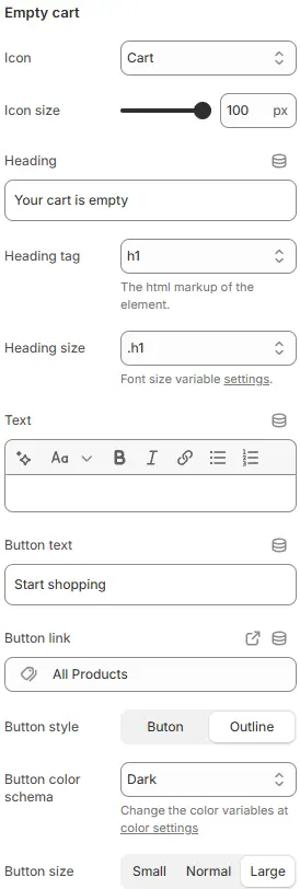
- Icon: Graphic shown when cart is empty.
- Icon size: Icon scale as percentage.
- Heading: Title text (e.g., “Your cart is empty”).
- Heading tag: HTML tag (
<h1>–<h6>). - Heading size: Font size from typography variables.
- Text: Supporting message (e.g., “Add items to get started.”).
- Button text: Label for action button (e.g., “Continue Shopping”).
- Button link: Destination URL (e.g.,
/collections/all). - Button style:
button,outline, orlink. - Button color schema: From Theme Settings → Basic Settings → Colors.
- Button size:
Small,Default, orLarge.
Recommended Products

- Manage recommendations by adding or removing the Featured products block on the left side of the cart layout.
- Position:
Cart item below: Below cart items (when cart not empty)Empty cart below: Below empty state contentBoth: Show in both contextsHide: Disable entirely
Child Blocks
Featured products
Displays product recommendations using the full Blocks → Function Block → Featured Products configuration.
Cart checkout
Renders the checkout area (subtotal, notes, buttons). Full settings: Blocks → Specific Block → Cart Checkout.