Collections
The Collections section is the main container for the main-collection template, used on product collection listing pages. It controls layout, filtering, pagination, and related content.
Settings
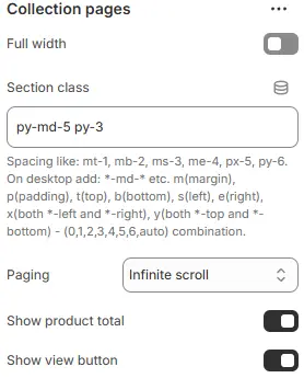
- Full width: Expand the section to 100% of the viewport width.
- Section class: Custom CSS class for the entire collection section.
- Paging: Defines navigation method.
Infinite scroll: Load more products on scrollShow buttons: Traditional pagination with “Load more” or numbered links
- Show view button: Display the switch button between grid and list icons.
Filters

- Enable filter: Toggles whether users can interact with filters (e.g., category, price, size, color).
- Filter button color: Default appearance of the main “Filter” button (before any selection is made).
- Applied button color: Visual indicator when one or more filters are actively applied.
- Clear button color: Resets all selected filters back to default state.
Breadcrumbs

- Position: Placement relative to page content (e.g., below title or above products).
- Link color schema: Text color from Theme Settings → Basic Settings → Colors.
- Alignment: Horizontal alignment (
left,center,right).
Related Collections

- Style:
Buttons: Display as clickable links or pillsGallery: Show as a visual grid of collection cards
Product Cards

- Items per page: Maximum products displayed per page.
- Items per row (Desktop): Number of products per row on desktop large screens.
- Items per row (Tablet): Number of products per row on tablet.
- Items per row (Smartphone): Number of products per row on smartphone.
- Enable masonry: Allow variable-height product cards for dynamic layouts.
Collection description
- Show collection description: Display the collection description.
Child Blocks
Page top banner
Controls the inner-page hero area (title, background, overlay).
Full settings: Blocks → Specific Block → Page Top Banner.
Filters
Sidebar filtering panel for variants, price, tags, etc.
Full settings: Blocks → Specific Block → Filters.
Product cards
Individual product displays with swatches, badges, pricing, etc.
Full settings: Blocks → Specific Block → Product Cards.
Related collections
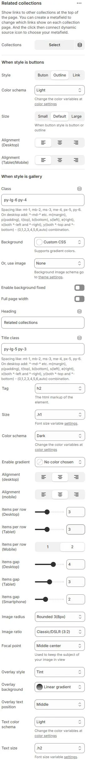
- Collections: Manually select related collections to feature.
When style is buttons
- Style: Choose presentation format:
Button→ Filled background + text (primary CTA style)Outline→ Border-only with transparent fill (subtle, clean)Link→ Text-only underline/hover effect (minimalist)
- Color schema: From Theme Settings → Basic Settings → Colors
- Size: Button dimensions:
Small,Default,Large→ Adjusts padding, font size, and touch target area.
- Alignment (Desktop): Horizontal alignment of button group.
- Alignment (Tablet/Mobile): Same as above but optimized for smaller screens.
When style is gallery
- Class: Custom CSS classes for outer container.
- Background: Set background for entire gallery section.
- Option 1:
Custom CSS→ Enter gradient/color code directly (e.g.,linear-gradient(to right, #f0f0f0, #ffffff)) - Option 2:
Or, use image→ Upload/select background image → Goes to theme settings for global management.
- Option 1:
- Enable background fixed: If enabled, background stays static while content scrolls over it (parallax-like effect).
- Full page width: Expand to 100% viewport width
- Heading: Title shown above gallery (e.g., “Related Collections”).
- Title class: CSS class for heading element.
- Tag: HTML tag used for heading (semantic structure).
- Size: Font size variable for heading.
- Color schema: Text/background contrast scheme for heading.
- Enable gradient: Apply gradient overlay to heading background.
- Alignment (desktop) / (mobile): Horizontal alignment of heading text.
- Items per row (Desktop): Display quantity per row on the desktop.
- Items per row (Tablet): The tablet displays the quantity per row.
- Items per row (Smartphone): The number of displays per line on the smartphone device.
- Items gap (Desktop): Desktop device gap.
- Items gap (Tablet): Gap between tablet devices.
- Items gap (Smartphone): Smartphone device gap.
- Image radius: Corner rounding for images.
- Image ratio: Aspect ratio enforced on all thumbnails.
AutoCustom (3:1)Ultrawide (21:9)Double-width (2:1)Widescreen / HD (16:9)Classic / DSLR (3:2)ISO Paper (1.4:1)Standard Definition/SD (4:3)Landscape (5:4)Square (1:1)Instagram Portrait (4:5)Portrait (3:4)Pinterest Pin (2:3)Portrait (9:16)
- Focal point: Determines which part of image remains visible when cropped.
- Overlay style: Type of overlay effect.
Tint: Dark overlay over imageBox: Light background behind textText shadow: Shadow for contrastText shadow and tint: CombinationNo overlay: Text directly on image
- Overlay background: Background type for overlay.
- Overlay text position: Where title appears relative to image.
- Text color schema: Contrast scheme for overlaid text from Theme Settings → Basic Settings → Colors.
- Text size: Font size from Theme Settings → Basic Settings → Typography
Animations on Scroll
- Enable entrance animations as block enter the viewport.
- Configuration follows the standard Animations on Scroll settings.
- See: Blocks → Overview → Animations on scroll