Newsletter Form
A subscription form block for collecting email addresses. Add this block to any section or layout where you want to encourage visitors to join your mailing list.
Main Settings
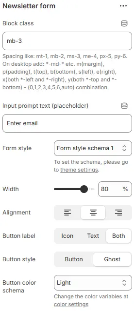
- Block class: Custom CSS class applied to the block container for additional styling or spacing control. Blocks → Overview → General Settings
- Input prompt text (placeholder): The placeholder text shown inside the email input field (e.g., “Enter your email”).
- Form style: Styling preset for the email input field.
→ Defined in Theme Settings → Style scheme settings → Form Style Schema - Width: Width of the form container as a percentage of its parent (e.g.,
100%,50%). - Alignment: Horizontal alignment within the parent container (left, center, or right).
- Show button label: Choose what appears on the submit button:
Icon: Display only an icon (e.g., arrow or envelope)Text: Display only text (e.g., “Subscribe”)Both: Show both icon and text
- Button style: Defines the visual treatment of the button element.
Button→ Applies a solid, filled background with defined borders and shadows. Ideal for primary actions where you want the button to stand out clearly (e.g., “Submit”, “Buy Now”).Ghost→ Renders as a transparent button — typically just text with filled background on hover. Perfect for secondary actions (“Cancel”, “Learn More”) or when you want subtle UI presence without visual weight. - Button color schema: Sets the base color theme applied to the button’s background, text, and hover states.
Animations on Scroll
- Enable entrance animations as block enter the viewport.
- Configuration follows the standard Animations on Scroll settings.
- See: Blocks → Overview → Animations on scroll