Heading
Used primarily in sections or parent blocks where a title or heading is needed.
Main Settings
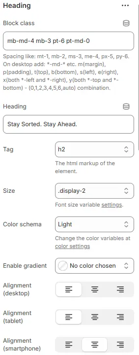
- Block class: Applies custom CSS utility classes to the heading container for precise spacing and layout control. Blocks → Overview → General Settings
- Example:
mb-md-4 mb-3 pt-6 pt-md-0
→ On mobile: bottom margin =1rem, top padding =3rem
→ On medium+ screens: bottom margin =1.5rem, top padding =0 - Supports responsive spacing using Bootstrap-like syntax:
m(t/b/s/e/x/y)-[size],p(t/b/s/e/x/y)-[size]with values(0|1|2|3|4|5|6|auto)
- Example:
- Heading: The visible text content of the heading element.
- Current value: Stay Sorted. Stay Ahead. — concise, motivational messaging suitable for hero sections or feature headers.
- Tag: Defines the HTML semantic tag used for rendering (e.g.,
h2). Affects accessibility, SEO, and document structure. Should reflect hierarchy — e.g., useh1only once per page. - Size: Sets the visual font size via theme-defined CSS variable (e.g.,
.display-2). Does not change the HTML tag — overrides its default styling for design consistency across breakpoints. Theme Settings → Basic Settings → Typography - Color schema: Applies a global color variable (e.g.,
Light) to the heading text. Actual colors are managed in theme’s centralized color settings panel for brand-wide updates. Theme Settings → Basic Settings → Colors - Enable gradient: Set custom color codes or gradients, replace the Color schema after setting, and prioritize the one defined here.
- Alignment (desktop): Horizontal alignment on desktop (left, center, right).
- Alignment (tablet): Horizontal alignment on tablet devices.
- Alignment (smartphone): Horizontal alignment on smartphone devices.
💡 This section enables granular control over heading presentation across all device sizes — essential for creating visually balanced, accessible, and branded interfaces. Use responsive classes and alignment options to adapt content dynamically without duplicating elements.
Rotating Keywords
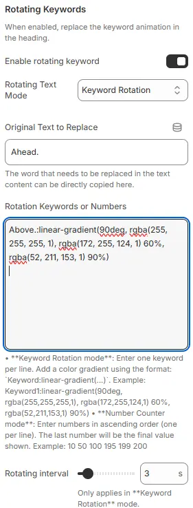
When enabled, replace the keyword animation in the heading.
-
Enable rotating keyword: Toggles the dynamic text replacement feature in the heading. When enabled, it cycles through predefined keywords or numbers to create animated, attention-grabbing headlines (e.g., “Stay Sorted. Stay [Ahead | Ahead | Ahead]” → rotates between variants).
-
Rotating Text Mode: Selects the animation behavior for the rotating content.
Keyword Rotation: — replaces a specific word with a list of alternating terms.Number Counter Animation: for incrementing values.
-
Original Text to Replace: Specifies the exact substring within the heading that will be dynamically replaced during rotation.
- Example:
Ahead.— this word will cycle through the list defined below. - Must match exactly (including punctuation/case) for replacement to trigger.
- Example:
-
Rotation Keywords or Numbers: Defines the pool of texts or values to rotate through. Supports two modes:
▶️ Keyword Rotation mode (current):
- Enter one keyword per line.
- Optional: Apply gradient coloring using syntax:
keyword:linear-gradient(angle, color1, color2, ...)
Example:→ Renders “Above.” with a smooth green-to-white horizontal gradient.Above.:linear-gradient(90deg, rgba(255,255,255,1), rgba(172,255,124,1) 60%, rgba(52,211,153,1) 90%)
▶️ Number Counter Animation mode (not active here):
- Enter ascending numbers, one per line.
- Last number becomes the final displayed value after counting up.
- Example:
10
50
100
195
199
200
-
Rotating interval: Sets the time (in seconds) each keyword/number is displayed before switching to the next.
- Current value:
3 s— each term shows for 3 seconds. - Only applies when “Keyword Rotation” mode is selected.
- Lower values = faster cycling; higher values = slower, more readable transitions.
- Current value:
💡 This component adds motion and visual interest to static headings — ideal for hero banners, CTAs, or promotional sections. Use gradients sparingly for emphasis, and ensure rotation speed doesn’t overwhelm users. Test accessibility: avoid rapid flashing for seizure-sensitive audiences.
Add Icon
Optionally prepend or append an SVG icon to the heading.

- Icon: Choose from the theme’s built-in icon dropdown.
- Size: Icon size (e.g., small, medium, large, or custom scale).
- Color schema: Icon color, selected from theme color variables.
- Position: Placement of the icon—
Before(left of heading) orAfter(right of heading).
Animations on Scroll
- Enable entrance animations as block enter the viewport.
- Configuration follows the standard Animations on Scroll settings.
- See: Blocks → Overview → Animations on scroll