Contact Form
The Contact Form block is a flexible form component that can be added to any section or layout to collect user input. It supports multiple field types and is suitable for general inquiries, product customization requests, and more.
Settings
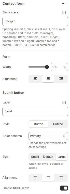
- Block class: Custom CSS class for the form container (useful for spacing or layout adjustments). Blocks → Overview → General Settings
Form
- Width: Set the form’s width (e.g.,
100%,50%). - Alignment: Horizontal alignment of the entire form (
left,center,right).
Submit Button
- Label: Text displayed on the submit button (e.g., “Send Message”).
- Style: Visual style—
button(solid) oroutline(hollow). - Color schema: Button color from Theme Settings → Basic Settings → Colors.
- Size:
small,default, orlarge. - Alignment: Horizontal alignment of the button (
left,center,right). - Enable 100% width: The button occupies the entire container.
Animations on Scroll
- Enable entrance animations as block enter the viewport.
- Configuration follows the standard Animations on Scroll settings.
- See: Blocks → Overview → Animations on scroll
Child blocks

The form supports multiple field types. Each field type shares a consistent structure:
Block Common Settings
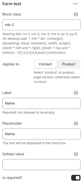
- Block class: CSS class for spacing or styling the individual field container. Blocks → Overview → General Settings
- Applies to:
product: Use when the form appears on a product page and needs to pass custom data to the cart (e.g., engraving text).Contact: Default for standard contact forms.
- Label: Field label (e.g., “Your Name”).
- Placeholder: Hint text inside the input (e.g., “Enter your email”).
- Default value: Pre-filled value. For select, radio, or checkbox fields, if this matches an option, that option is selected by default.
- Is required?: Toggle whether the field must be filled out before submission.
Style

- Layout:
Label up: Label above the inputLabel left: Label and input side-by-side (label on left)Input group: Label and input merged into a single bordered unitFloating label→ Label starts inside the input as placeholder, then animates upward when user types or focuses
- Size: Input size—
small,default, orlarge. - Style: Form styling preset from Theme Settings → Style scheme settings → Form Style Schema.
Label

- Width: Width of the label (as a percentage) when Layout = Label left.
- Color schema: Label text color from Theme Settings → Basic Settings → Colors.
- Background: Sets background color/style for the label — only active when layout is
Input group. - Enable bold: Toggle bold font weight for the label.
Form checkbox
- Options: One option per line (e.g.,
Red,Blue,Green). - Make all options inline?: Display options horizontally (inline) instead of vertically.
- Other field parameters reference: Block Common Settings
Form file
- File upload field (accepts standard file types).
- Main field parameters reference: Block Common Settings
Form radio
- Options: One option per line.
- Make all options inline?: Display radio buttons horizontally.
- Other field parameters reference: Block Common Settings
Form select
- Options: One option per line.
- Other field parameters reference: Block Common Settings
Form text
- Single-line text input (e.g., name, email, phone).
- Main field parameters reference: Block Common Settings
Form textarea
- Multi-line text input.
- Default rows: Initial number of visible text rows (e.g.,
4). - Other field parameters reference: Block Common Settings
💡 All fields render responsively and inherit global input styles unless overridden by the selected Input Style Schema.