Image
A block primarily used to display images.
Main Settings
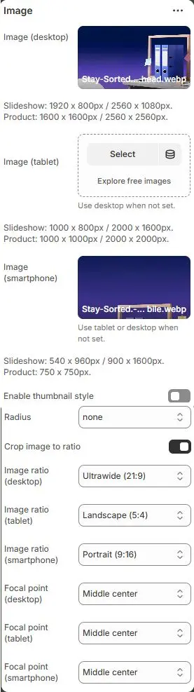
- Image (desktop): Sets the image for desktop viewports.
- Recommended resolutions:
→ Slideshow:1920 × 800px/2560 × 1080px
→ Product:1600 × 1600px/2560 × 2560px - Ensures crisp display on high-DPI screens and wide monitors.
- Recommended resolutions:
- Image (tablet): Optional override for tablet devices.
- Suggested sizes:
→ Slideshow:1000 × 800px/2000 × 1600px
→ Product:1000 × 1000px/2000 × 2000px
- Suggested sizes:
- Image (smartphone): Image optimized for mobile screens.
- Recommended sizes:
→ Slideshow:540 × 960px/900 × 1600px
→ Product:750 × 750px - Falls back to tablet or desktop if not set — but best practice is to provide mobile-specific assets for performance and composition.
- Recommended sizes:
- Enable thumbnail style: Toggles whether the image displays as a rounded/cropped thumbnail.
- Radius: Controls corner rounding of the image. Options include:
rounded-0,rounded-1,rounded-2,rounded-3,rounded-4,rounded-5,rounded-circle,rounded-pill. - Crop image to ratio: Enables automatic cropping of uploaded images to match specified aspect ratios per device.
- Image ratio (desktop): Aspect ratio applied to desktop image when cropping is enabled.
- Image ratio (tablet): Aspect ratio for tablet viewport.
- Image ratio (smartphone): Aspect ratio for smartphone.
- Auto
- Custom (3:1)
- Ultrawide (21:9)
- Double-width (2:1)
- Widescreen / HD (16:9)
- Classic / DSLR (3:2)
- ISO Paper (1.4:1)
- Standard Definition/SD (4:3)
- Landscape (5:4)
- Square (1:1)
- Instagram Portrait (4:5)
- Portrait (3:4)
- Pinterest Pin (2:3)
- Portrait (9:16)
- Focal point (desktop/tablet/smartphone): Defines which part of the image remains visible during cropping.
(e.g.,
Top left,Top center,Top right,Middle left,Middle center,Middle right,Bottom left,Bottom center,Bottom right)
💡 This section enables responsive, device-specific imagery with intelligent cropping and focal point control — critical for maintaining visual impact and performance across screen sizes. Always optimize images before upload (compress, correct format) and use appropriate ratios to avoid distortion or wasted bandwidth.
Attribute (optional)

- Image fetchpriority: Set browser loading priority:
high– Load early (e.g., hero images)low– Defer loadingauto– Default browser behavior
- Image loading: Define loading behavior:
eager– Load immediatelylazy– Load when near viewport (recommended for performance)manual– Controlled via JavaScript
- Image link: Add a URL to make the image clickable.
- Link target: Specify how the link opens:
_blank– New tab/window_self– Same tab (default)_parent– Parent frame_top– Top-level browsing context
Animations on Scroll
- Enable entrance animations as block enter the viewport.
- Configuration follows the standard Animations on Scroll settings.
- See: Blocks → Overview → Animations on scroll