Product Cards
Product Cards are primarily used for product recommendation lists and collection pages.
Configuration Settings

- Product: Select a specific product to display.
- This is mainly used for hotspot sections or single-product showcases.
- Leave this field empty for paginated or dynamic product lists.
Cards Layout
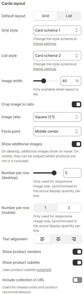
- Default layout: Choose between
GridandList. - Grid style: Apply a predefined card style scheme when layout is set to Grid. Theme Settings → Style scheme settings → Cards Style Schema
- List style: Apply a predefined card style scheme when layout is set to List. Theme Settings → Style scheme settings → Cards Style Schema
- Image width: (List layout only) Set the width of the product image as a percentage of the card.
- Crop image to ratio: Enable cropping of product images to a specific aspect ratio.
- Image ratio: Select from preset ratios:
- Shortest image
- Tallest image
- Auto
- Custom (3:1)
- Ultrawide (21:9)
- Double-width (2:1)
- Widescreen / HD (16:9)
- Classic / DSLR (3:2)
- ISO Paper (1.4:1)
- Standard Definition/SD (4:3)
- Landscape (5:4)
- Square (1:1)
- Instagram Portrait (4:5)
- Portrait (3:4)
- Pinterest Pin (2:3)
- Portrait (9:16)
- Focal point: Control which part of the image is preserved during cropping (e.g.,
Top left,Top center,Top right,Middle left,Middle center,Middle right,Bottom left,Bottom center,Bottom right). - Show additional images: Enable secondary product images. On desktop, they appear on hover; on mobile, they’re swipeable (when not in a carousel).
- Number per row (desktop): Only used for responsive image size, synchronized to the actual display quantity per line.
- Number per row (mobile): Only used for responsive image size, synchronized to the actual display quantity per line.
- Text alignment: Align all text content (title, price, etc.) to left, center, or right.
- Show product vendors: Display the product vendor name.
- Show product subtitle: Show the product’s subtitle or excerpt.
- Include collection in URL: Append the collection handle to product URLs for SEO and navigation context.
Buy button
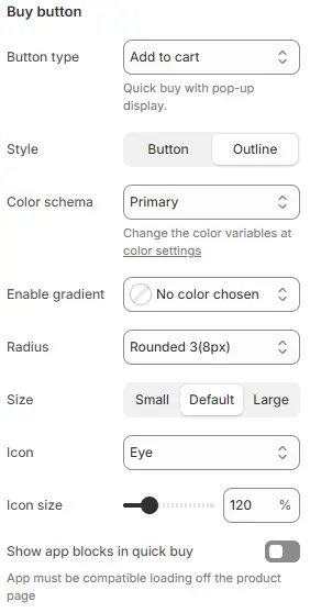
- Button type: Defines the primary action triggered when users click the product button.
for standard e-commerce conversion paths.
None→ No action; button may be hidden or disabled.Quick buy→ Direct checkout without navigating to cart (often skips cart page).View details→ Redirects user to full product detail page.Add to cart→ Default behavior; adds item and optionally shows mini-cart or success toast.
- Style: Visual presentation of the button.
- Options:
Button(filled) |Outline(border-only)
- Options:
- Color schema: Applies global color theme to the button.
- Enable gradient: Custom colors support gradients; once set, they will replace the Color schema.
- Radius: Corner rounding of the button. (e.g., Rounded 1–5, Pill, Circle).
None(0px)→ Sharp corners; clean, formal, or minimalist aesthetic.Rounded 1(2px)→ Subtle rounding; barely noticeable, good for conservative designs.Rounded 2(4px)→ Mild curvature; balanced between professional and approachable.Rounded 3(8px)← Selected → Ideal for most consumer-facing interfaces.Rounded 4(1rem)→ ~16px (assuming root font-size = 16px); very soft, playful, or mobile-first design.Rounded 5(2rem)→ ~32px; extremely rounded, often used in pill-shaped components or bold branding.Circle(50%)→ Fully circular; typically for avatars, icons, or small action buttons.Pill(100rem)→ Maximum horizontal rounding; creates “pill” shape regardless of element width.
- Size: Physical dimensions of the button.
- Options:
Small|Default|Large
- Options:
- Icon: Symbol displayed alongside or within the button text.
- Icon Size: Scale of the icon relative to button.
- Show app blocks in quick buy: Allow third-party app blocks (e.g., size guides, loyalty widgets) to appear inside the quick-buy modal.
Product Price

- Show product price: Toggle display of the main price.
- Show product compare at price: Show strikethrough original price when discounted.
- Price style: Select a price styling scheme defined in Theme Settings → Style scheme settings → Price Style Schema.
Variant Swatches
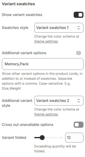
- Show variant swatches: Display color/size options as visual swatches.
- Swatches style: Apply a swatch styling scheme from Theme Settings → Style scheme settings → Variant Swatches Schema.
- Additional variant options: List other variant names (e.g.,
Size,Material) to show as swatches beyond the defaultColor. - Additional variant style: Apply a Variant styling scheme from Theme Settings → Style scheme settings → Variant Swatches Schema.
- Cross out unavailable options: Visually disable out-of-stock variants.
- Variant folded: Collapse variant options when count exceeds this number.
- Exceeding quantity will be folded.
Reviews Rating Star

- Show rating star: Display star ratings (requires a reviews app).
- Show reviews count: Show number of reviews (e.g., “(42)”).
- Size: Star icon size.
- Color schema (inactive): Color of unlit stars.
- Color schema (activated): Color of filled stars.
Labels
Display labels on product images. Use the product.preorder template for a product to show 'pre-order' label. Add the product tag 'Refurbished', 'Bulk order' to show 'refurbished', 'bulk order' label. Add variant name 'qty' to show 'tiered pricing' label.
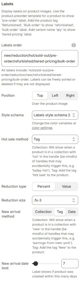
- Labels order: Defines the sequence in which multiple labels appear.
new/reduction/hot/sold-out/pre-order/refurbished/tiered-pricing/bulk-order- All available labels listed abvoe; can be freely reordered or hidden by removing from list.
- Position: Placement of labels relative to product image.
- Options:
Top|Left|Right
- Options:
- Style schema: Apply a badge styling scheme from Theme Settings → Style scheme settings → Labels Style Schema.
- Hot sale method: Determines how “Hot” label is triggered.
Collection→ Label shows when product belongs to a collection with “hot” in its handle or title (e.g., “Summer Hot Picks”). Risk of false positives if naming isn’t precise.Tag← Selected → Most controlled and explicit; requires manual or automated tagging. Recommended for accuracy.Always→ Forces “Hot” label to display on all products — useful for promotions or testing, but not recommended for live stores unless intentionally blanket-applied.
- Reduction type: Format for displaying discount amount.
Percent: Shows as “-20%” |Value: Shows as “-$10” .
- Reduction size: Font size class for reduction label text.
- New arrival method: Collection: Will show when a product is in a collection with 'new' in the handle (be mindful of handles that may accidentally trigger this, e.g. 'earrings-from-new-york'). Tag: Add the tag 'New' to the product.
- New arrival date limit: Time window (in days) for “New” label visibility when using “Date” method.
- Slider set to
7→ Label appears only if product was created within last 7 days. - Adjustable range typically 1–30+ days.
- Slider set to
Inventory Label

- Show inventory label: Display stock level (e.g., “Only 3 left”).
- Color schema: inventory label's color schema,Settings from Color Variables.
- Threshold: Show quantity only when stock is below this number. Set to
0to always show full inventory count (for single-variant products).
Theme Label

- Position: Where to display a custom theme-based label (e.g., “Bestseller”, “Eco-Friendly”):
DisabledBelow imageBelow product vendorsBelow product titleBelow product subtitleBelow product priceBelow product variant swatchesBelow reviews ratingBelow inventory label
- Style: Apply a tag styling scheme from Theme Settings → Style scheme settings → Tags Style Schema.
Animations on Scroll
- Enable entrance animations as cards enter the viewport.
- Configuration follows the standard Animations on Scroll settings.
- See: Blocks → Overview → Animations on scroll