Filters
The Filters block provides sidebar-based filtering functionality for collection pages and search results pages, allowing customers to refine products by variant options, price, availability, and more.
Filters Settings
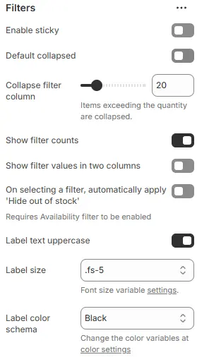
- Enable sticky: Make the filter sidebar stick to the top of the viewport while scrolling.
- Default collapsed: Collapse all filter groups by default (users can expand them manually).
- Collapse filter column: Automatically collapse filter options when the number of values exceeds a certain threshold.
- Show filter counts: Display the number of products matching each filter option (e.g., “Red (12)”).
- Show filter values in two columns: Present filter options in a two-column layout for better space utilization.
- On selecting a filter, automatically apply 'Hide out of stock': When a filter is applied, automatically hide out-of-stock items.
- Label text uppercase: Converts all filter labels (e.g., “Color”, “Price Range”) to UPPERCASE for stylistic consistency.
- Label size: Controls font size of filter section titles using theme’s typography scale.
- Label color schema: Sets the text color for filter labels via theme’s color system.
Filters Options Buttons

- Filters to show as buttons: List variant names (e.g.,
Size,Taille,Größe) to display as interactive buttons instead of dropdowns or lists. - Style: Visual style for the filter buttons, using a preset from Theme Settings → Style scheme settings → Variant Swatches Schema.
- Form style: Styling for the price input. Select a preset from Theme Settings → Style scheme settings → Form Style Schema
Swatches Icons

-
Enable swatches icon: Show visual swatches (e.g., color dots, size icons) next to filter labels.
-
Style: Styling for swatch icons, based on Theme Settings → Style scheme settings → Variant Swatches Schema.
-
Layout: Arrangement of swatch items:
Two columnOne columnNo label(icons only, no text)
Vendor / Brand icons
Set vendor / brand icons go to theme settings → Basic Settings → Filters.