Page Top Banner
The Page Top Banner block appears at the top of inner pages (excluding the homepage) and is used to display a hero-style banner or breadcrumb navigation area. It supports dynamic background images and customizable overlay text for enhanced visual storytelling.
Settings

- Full width: Toggle to make the banner span the entire viewport width.
- Layout: Defines the structural arrangement of text and image in the banner.
Only text/No image→ displays text-only content, no image backgroundOverlay→ text layered over full-width imageText above image→ stacked layout: text on top, image belowText below image→ stacked layout: image on top, text belowText left image→ side-by-side: text on left, image on rightText right image→ side-by-side: text on right, image on left
- Text width: Controls horizontal width of the text block as percentage of container.
- Text horizontal: Horizontal alignment of text inside the banner.
- Text vertical: Vertical positioning of text within the banner area.
Top|Middle|Bottom
Overlay
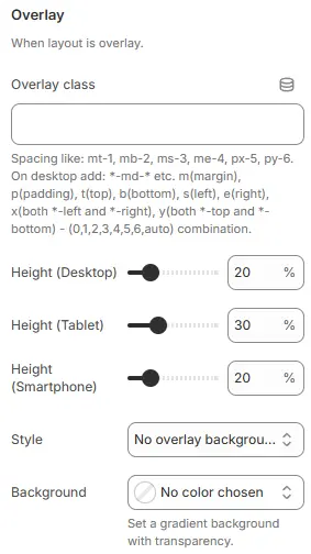
- Overlay class: Custom CSS class for advanced styling of the overlay container.
- Height (Desktop): Sets overlay height as percentage of viewport or container on desktop.
- Height (Tablet): Overlay height for tablet breakpoints.
- Height (Smartphone): Overlay height for mobile devices.
- Style: Controls the visual treatment of the text overlay area.
No overlay background→ transparent, no fill or effect appliedTint→ applies a semi-transparent color wash over the image behind textBox→ places text inside a solid or outlined background boxText shadow→ adds drop shadow to text for contrast against busy backgroundsText shadow and tint→ combines both shadow and tint effects for maximum readability
- Background: Color or gradient picker for overlay background.
- Note: Supports solid colors or gradients with transparency control
Page title
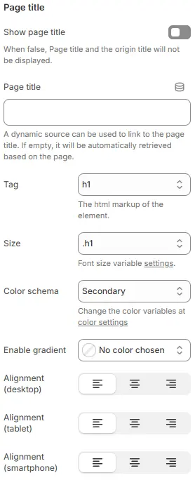
- Show page title: Toggle to display or hide the page title.
- Page title: Manual input field for custom page title text.
- If empty, it will be automatically retrieved based on the page.
- A dynamic source can be used to link to the page title.
- Tag: HTML element tag used for rendering the title.
h1-h6,div→ semantically marks as primary heading
- Size: CSS class controlling font size via theme variables.
.h1-.h6,.fs-1-.fs-6,display-1-display-6Font size variable settings implies this links to global typographic system
- Color schema: Defines which color palette the title uses.
- Link Change the color variables at color settings suggests centralized theming control
- Enable gradient: Replace the Color schema after setting, allowing applying a gradient color to the title text
- Alignment (desktop): Horizontal alignment of title on desktop screens.
- Alignment (tablet): Horizontal alignment for tablet breakpoints.
- Alignment (smartphone): Horizontal alignment for smartphone devices.
SEO Description

- Show seo description: Toggle to display or hide the SEO meta description on-page (often used for rich snippets or structured data visibility).
- Size: Font size class applied to the SEO description text.
.h1-.h6,.fs-1-.fs-6,display-1-display-6Font size variable settings implies this links to global typographic system
- Color schema: Determines which color palette the description text inherits.
- Link Change the color variables at color settings suggests centralized theming control
- Line height: Controls the vertical spacing between lines of text in the SEO description (or other applicable elements).
Compact→ tighter line spacing, suitable for dense content or space-constrained layouts.Small→ slightly reduced spacing; may be used for secondary text or captions.Default→ recommended baseline for body text and descriptions.Large→ increased spacing for improved legibility, often used in headlines or accessibility-focused designs.
- Alignment (desktop): Horizontal alignment of SEO description on desktop screens.
- Alignment (tablet): Horizontal alignment for tablet breakpoints.
- Alignment (smartphone): Horizontal alignment for smartphone devices.
Image
Customize your image using the following settings. Connecting to dynamic sources is supported. If not set, collection image will be used by default.
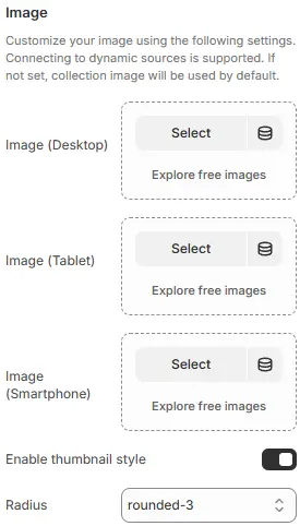
- Image (Desktop): Set an image optimized for desktop screen dimensions.
- Image (Tablet): Set an image optimized for tablet screen dimensions.
- Image (Smartphone): Set an image optimized for smartphone screen dimensions.
- Enable thumbnail style: Toggle to display or hide the thumbnail styling (e.g., outer border, shadow, or frame).
- Radius: Applies moderate corner rounding to images.
none/squarerounded-1,rounded-2,rounded-4, etc. (increasing radius)circleorpill(for avatars or badges)
Child Blocks
Blocks that can be freely added or removed:

Heading
Detailed settings reference: Blocks → Basic Block → Heading.
Text
Detailed settings reference: Blocks → Basic Block → Text.
Countdown timer
Detailed settings reference: Blocks → Basic Block → Countdown timer.