Featured Product
The Featured Product block displays a single product with full detail—including media gallery, title, price, variant picker, and buy buttons—allowing customers to purchase directly from any page.
Settings
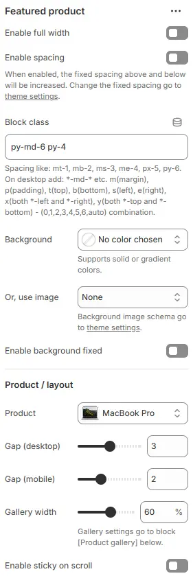
- Enable full width: Expand the block to 100% of the viewport width.
- Enable spacing: Adds fixed vertical spacing (margin) above and below the FAQ block.
- Block class: Custom CSS class for spacing or layout overrides.
- Background: Set a solid or gradient background color.
- Or, use image: Apply a background image using a preset from Theme Settings → Style scheme settings → Background Image Schema.
- Enable background fixed: Fixes the background image during scroll (parallax effect).
All settings above follow: Blocks → Overview → General Settings
Product / layout
- Product: Select a specific product to feature.
- Grid gap (desktop): Controls the spacing between grid items on large screens.
- Grid gap (tablet): Sets the spacing between grid items on medium-sized devices (tablets).
- Grid gap (smartphone): Defines the spacing between grid items on smartphone devices.
- Enable sticky on scroll: Keep the product info panel fixed while scrolling (ideal for long descriptions).
Child Blocks
It mainly consists of two parts: Product gallery and Product info.
Product Gallery
Interactive media gallery powered by Swiper, supporting product images, product videos, and product 3D models.
Settings

-
Layout: Gallery layout style:
Carousel - thumbnails top: Main media in a carousel with thumbnail navigation aboveCarousel - thumbnails bottom: Thumbnails below the main mediaCarousel - thumbnails left: Thumbnails to the left of the main mediaCarousel - thumbnails right: Thumbnails to the right of the main mediaOne column: All media displayed in a single vertical columnTwo column: Media arranged in two vertical columns
-
Media ratio: Aspect ratio applied to all media (images, videos, and 3D models)—e.g.,
16:9,1:1,3:4,21:9, etc.AutoCustom (3:1)Ultrawide (21:9)Double-width (2:1)Widescreen / HD (16:9)Classic / DSLR (3:2)ISO Paper (1.4:1)Standard Definition/SD (4:3)Landscape (5:4)Square (1:1)Instagram Portrait (4:5)Portrait (3:4)Pinterest Pin (2:3)Portrait (9:16)
Carousel Slide
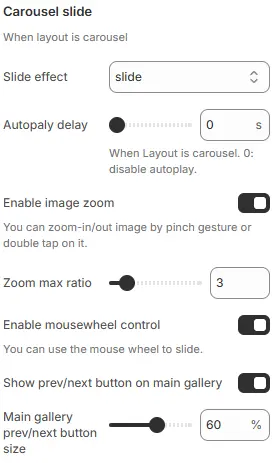
- Slide effect: Defines the transition animation style when sliding between items.
slide→ Standard horizontal sliding transition (default)fade→ Items fade in/out without movementcube→ 3D cube rotation effect between slidescoverflow→ Centered active slide with side items angled outward (like iTunes cover flow)flip→ Horizontal or vertical flip animation between slidescards→ Card-style stacking with depth and perspective
- Autoplay delay: Sets time interval (in seconds) before automatically advancing to next slide.
0 s→ Autoplay disabled (manual navigation only).>0 s→ Enables automatic cycling; e.g.,5= advances every 5 seconds.
- Enable image zoom: Allow click-to-zoom on images
- Zoom max ratio: Zoom level (2x–10x)
- Enable mousewheel control: Allows users to navigate slides using mouse scroll wheel.
- Show prev/next button on main gallery: Toggles visibility of left/right navigation arrows on main image.
- Main gallery prev/next button size: Scales navigation arrows as percentage of default size as percentage.
Thumbnails
When layout is carousel, show thumbnails.
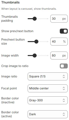
- Thumbnails padding: Set the padding spacing between the two ends of the Thumbnails container.
- Show prev/next button: Navigation for thumbnail pagination
- Prev/next button size: Thumbnail nav button size (%)
- Image width: Fixed thumbnail width (in
px) - Crop image to ratio: Enable cropping
- Image ratio: Thumbnail aspect ratio.
Custom (3:1)Ultrawide (21:9)Double-width (2:1)Widescreen / HD (16:9)Classic / DSLR (3:2)ISO Paper (1.4:1)Standard Definition/SD (4:3)Landscape (5:4)Square (1:1)Instagram Portrait (4:5)Portrait (3:4)Pinterest Pin (2:3)Portrait (9:16)
- Focal point: Cropping focus (
Top left,Top center,Top right,Middle left,Middle center,Middle right,Bottom left,Bottom center,Bottom right) - Border color (inactive): Default thumbnail border
- Border color (active): Border for selected thumbnail
Media Images
Set the image types in the product media.

- Crop image to media ratio: Enforce gallery ratio on main images
- Focal point: Cropping focus for main images (
Top left,Top center,Top right,Middle left,Middle center,Middle right,Bottom left,Bottom center,Bottom right) - Show alt text over image: Overlay alt text on image
- Alt text icon: Prepend icon to alt text
Media Videos
Set the video type in the product media.
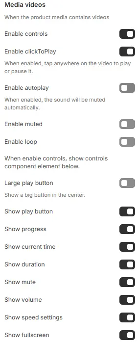
- Enable controls: Show video player UI controls
- Enable clickToPlay: Play/pause on click
- Enable autoplay, muted, loop: Standard video behaviors
When Enable controls is turned on, the following video control elements become available:
- Large play button: Displays a prominent play button centered over the video.
- Show play button: Toggle visibility of the play/pause button in the control bar.
- Show progress: Display the playback progress bar.
- Show current time: Show the current playback time (e.g.,
1:23). - Show duration: Display the total video duration (e.g.,
4:56). - Show mute: Include a mute/unmute button.
- Show volume: Show a volume slider for audio level adjustment.
- Show speed settings: Allow users to change playback speed (e.g., 0.5x, 1x, 1.5x, 2x).
- Show fullscreen: Display a button to toggle fullscreen mode.
Media Models
Set the type of 3D model in the product media.

- Background: Container background color from Theme Settings → Basic Settings → Colors
- Automatic play: Enable embedded model animations
- Automatic rotation: Rotate model continuously
- Rotation speed: The rotation speed is a percentage of 360 degrees, negative numbers rotate in the opposite direction, Degrees per frame (higher = faster)
Labels
Display labels on product main images. Use the product.preorder template for a product to show 'pre-order' label. Add the product tag 'Refurbished', 'Bulk order' to show 'refurbished', 'bulk order' label. Add variant name 'qty' to show 'tiered pricing' label.
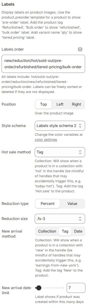
- Labels order: Defines the sequence in which multiple labels appear.
new/reduction/hot/sold-out/pre-order/refurbished/tiered-pricing/bulk-order- All available labels listed abvoe; can be freely reordered or hidden by removing from list.
- Position: Placement of labels relative to product image.
- Options:
Top|Left|Right
- Options:
- Style schema: Apply a badge styling scheme from Theme Settings → Style scheme settings → Labels Style Schema.
- Hot sale method: Determines how “Hot” label is triggered.
Collection→ Label shows when product belongs to a collection with “hot” in its handle or title (e.g., “Summer Hot Picks”). Risk of false positives if naming isn’t precise.Tag← Selected → Most controlled and explicit; requires manual or automated tagging. Recommended for accuracy.Always→ Forces “Hot” label to display on all products — useful for promotions or testing, but not recommended for live stores unless intentionally blanket-applied.
- Reduction type: Format for displaying discount amount.
Percent: Shows as “-20%” |Value: Shows as “-$10” .
- Reduction size: Font size class for reduction label text.
- New arrival method: Collection: Will show when a product is in a collection with 'new' in the handle (be mindful of handles that may accidentally trigger this, e.g. 'earrings-from-new-york'). Tag: Add the tag 'New' to the product.
- New arrival date limit: Time window (in days) for “New” label visibility when using “Date” method.
- Slider set to
7→ Label appears only if product was created within last 7 days. - Adjustable range typically 1–30+ days.
- Slider set to
Product info
The Product Info block is mainly used to freely add or delete blocks related to product information. The relevant blocks are as follows:
Card box
Used to add outer containers to product information to form independent partitions.

- Block class: Applies utility CSS classes to control spacing around the card.
- Style: Selects a predefined visual schema for the card’s appearance (border, shadow, background, radius, etc.). Reference Style Definition: Theme Settings → Style scheme settings → Cards Style Schema
- Show in quick buy: Toggles whether this card appears in a “Quick Buy” modal or sidebar (common in e-commerce).
Title
Product title block (recommended as <h1> for SEO).
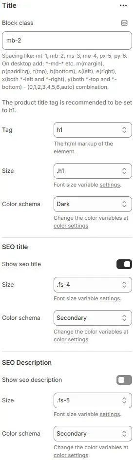
- Block class: The CSS class name for block containers, commonly used for spacing adjustments. Refer to the settings Blocks → Overview → General Settings
- Tag:
<h1>–<h6>or<div> - Size: Font size from Theme Settings → Basic Settings → Typography
- Color schema: Text color from Theme Settings → Basic Settings → Colors
SEO title
- Show seo title: Toggles visibility of a secondary title optimized for search engines or social sharing.
- Size: Font size from Theme Settings → Basic Settings → Typography
- Color schema: Text color from Theme Settings → Basic Settings → Colors
SEO Description
- Show seo description: Toggles visibility of a short descriptive summary (often used for meta descriptions or social previews).
- Size: Font size from Theme Settings → Basic Settings → Typography
- Color schema: Text color from Theme Settings → Basic Settings → Colors
Price
Displays current and compare-at pricing.
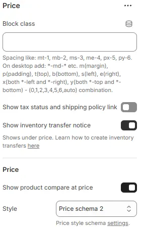
- Block class: The CSS class name for block containers, commonly used for spacing adjustments. Refer to the settings Blocks → Overview → General Settings
- Show tax status and shipping policy link: Toggle visibility of links to your store’s tax and shipping policy pages (typically displayed near the price).
- Show inventory transfer notice: Display a notice when inventory is being transferred between locations (e.g., “Stock arriving soon”).
Price
- Show product compare at price: Show the original/strikethrough price when a product is on sale.
- Style: Apply a pricing style preset from Theme Settings → Style scheme settings → Price Style Schema.
Barcode
Shows product barcode (if available).
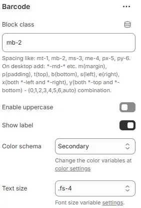
- Block class: The CSS class name for block containers, commonly used for spacing adjustments. Refer to the settings Blocks → Overview → General Settings
- Enable uppercase: Toggles whether the barcode text is displayed in ALL CAPS.
- Color schema: Color theme applied to the barcode text/label.
- Text size: Font size utility for the barcode value (and label, if shown).
Buy Buttons
Primary purchase controls.
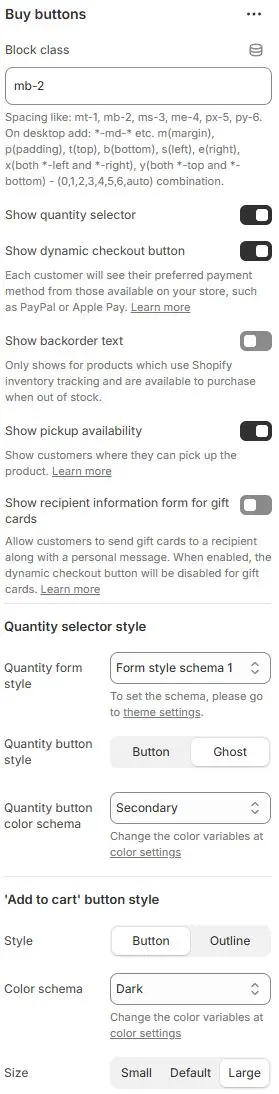
- Block class: The CSS class name for block containers, commonly used for spacing adjustments. Refer to the settings Blocks → Overview → General Settings
- Show quantity selector: Toggle visibility of the quantity input field (e.g., “1”, “2”, “3”) for adding multiple units to cart.
- Show dynamic checkout button: Display Shopify’s accelerated checkout buttons (e.g., Shop Pay, PayPal, Apple Pay) based on the customer’s device and region.
- Show backorder text: Show a notice (e.g., “Available for backorder”) only for products that:
- Use Shopify inventory tracking
- Are set to “Continue selling when out of stock”
- Show pickup availability: Display local pickup availability (e.g., “Available for pickup at Downtown Store”) if Shopify POS locations are configured.
- Show recipient information form for gift cards: Show fields to enter recipient name, email, and message when the product is a Shopify gift card.
Quantity Selector Style
- Quantity form style: Quantity form styling preset from Theme Settings → Style scheme settings → Form Style Schema.
- Quantity button style: Quantity button, Button style for increasing or decreasing quantity.
Button:SolidGhost: Hollow Borderless
- Quantity button color schema: Text and border color scheme, also chosen from Theme Settings → Basic Settings → Colors.
'Add to cart' Button Style
- Style: Button appearance—
button(solid fill) oroutline(hollow with border). - Color schema: Button color selected from the theme’s color variables in Theme Settings → Basic Settings → Colors.
- Size: Button size—
small,default, orlarge.
Collapsible Tab
Expandable content section (e.g., size guide, care instructions).
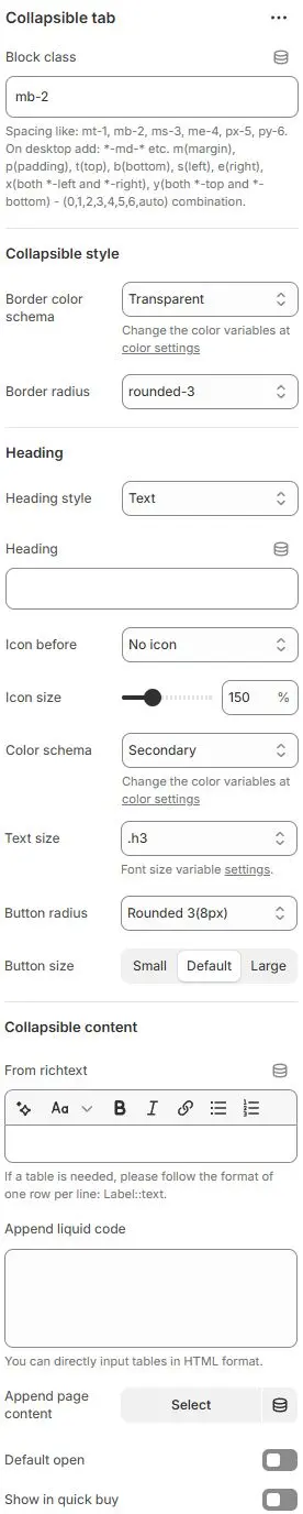
- Block class: The CSS class name for block containers, commonly used for spacing adjustments. Refer to the settings Blocks → Overview → General Settings
Collapsible style
- Border color schema: Border color selected from Theme Settings → Basic Settings → Colors.
- Border radius: Corner style—
rounded1torounded5,circle, orpill.
Heading
- Heading style: Defines how the clickable header is rendered.
Text– Displays as plain text without button styling; ideal for labels, headings, or non-interactive titles.Button– Renders as a solid filled button with background color and border; suitable for primary actions or clickable triggers.Button outline– Shows as a bordered button with transparent fill; used for secondary actions or when visual subtlety is preferred.Button ghost– Appears as a minimal button with no border or background (only text); often used for tertiary actions or hover-sensitive UI elements.
- Heading: The actual title/text displayed in the collapsible header.
- Icon before: Optional icon placed before the heading text.
- Icon size: Scales the icon relative to default.
- Color schema: Color theme applied to heading text/icon.
- Text size: Font size utility for the heading.
- Button radius: Corner rounding for the interactive header area (if styled as button).
- Button size: Preset sizing for the header’s clickable region.
Collapsible content
- From richtext: Rich text editor for entering formatted content inside the collapsed section. Can connect dynamic source meta fields.
- Append liquid code: Raw HTML/Liquid template injection zone. Generally used for specific table code.
- Append page content: Button to insert pre-built content blocks from your CMS/theme library.
⚙️ Tip: Use rich text to input static text content or connect to dynamic source metafield. Use liquid code to input custom liquid code or table data in HTML format. You can bind the page content of a page by yourself through page content. All three methods will be displayed after setting.
- Default open: Toggles whether the tab starts expanded or collapsed on page load.
- Show in quick buy: Determines if this tab appears within a “Quick Buy” modal.
Complementary Products
Suggest add-on items.
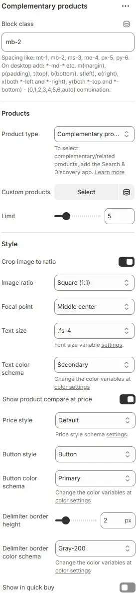
- Block class: The CSS class name for block containers, commonly used for spacing adjustments. Refer to the settings Blocks → Overview → General Settings
Products
- Product type: Defines how products are sourced for display.
Complementary products→ Automatically suggests items based on store logic (e.g., “Frequently bought together”, “You may also like”).Related products→ Items from same category/tag/collection.Custom products→ Manually selected by merchant via “Select” button.
- Custom products: Button to manually select specific products when “Product type = Custom products”.
- Limit: Maximum number of products to display in the section.
Style
- Crop image to ratio: Enable cropping of product images to a specific aspect ratio.
- Image ratio: Choose the target aspect ratio (e.g.,
1:1,16:9,3:4).AutoCustom (3:1)Ultrawide (21:9)Double-width (2:1)Widescreen / HD (16:9)Classic / DSLR (3:2)ISO Paper (1.4:1)Standard Definition/SD (4:3)Landscape (5:4)Square (1:1)Instagram Portrait (4:5)Portrait (3:4)Pinterest Pin (2:3)Portrait (9:16)
- Focal point: Control which part of the image is preserved during cropping (e.g.,
Top left,Top center,Top right,Middle left,Middle center,Middle right,Bottom left,Bottom center,Bottom right). - Text size: Font size utility for product titles/descriptions.
- Text color schema: Color theme for product text.
- Show product compare at price: Toggles visibility of “Compare at” price (original/strikethrough price).
- Price style: Visual treatment of the price text.
- Button style: Appearance of action buttons (e.g., “Add to Cart”, “View Details”)
- Button color schema: Color theme for buttons.
- Delimiter border height: Thickness of horizontal line separating this section from others.
- Delimiter border color schema: Color of the separator line.
- Show in quick buy: Determines if this section appears within a “Quick Buy” modal.
Countdown Timer
Urgency-driven countdown for promotions.
Full settings: Blocks → Basic Block → Countdown Timer
Custom Liquid
Embed raw Liquid/HTML/JS.
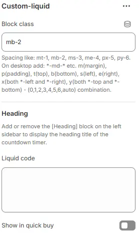
- Block class: The CSS class name for block containers, commonly used for spacing adjustments. Refer to the settings Blocks → Overview → General Settings
Heading: The collapsible tab’s title. Add a child Heading block to display it. Omit the child block if no title is needed. - Liquid code: Enter custom Liquid code
- Show in quick buy: Display this collapsible block inside the quick-buy modal.
Custom Option
Collect custom product inputs (e.g., engraving).
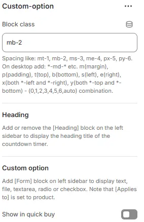
- Block class: The CSS class name for block containers, commonly used for spacing adjustments. Refer to the settings Blocks → Overview → General Settings
Heading: The collapsible tab’s title. Add a child Heading block to display it. Omit the child block if no title is needed.
- Custom option: Supports the following form block:

Form textForm radioForm checkboxForm selectForm fileForm textarea
For full configuration options (label, placeholder, validation, styling, layout, etc.), refer to: Blocks → Function Block → Contact Form.
⚠️ Important: When using this block inside a product context (e.g., to collect engraving text or customization details), ensure the Applies to parameter is set to
Product. This ensures the input data is correctly passed to the cart and order.

- Show in quick buy: Display this collapsible block inside the quick-buy modal.
Description
Render full product description.
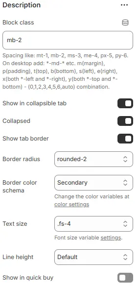
- Block class: The CSS class name for block containers, commonly used for spacing adjustments. Refer to the settings Blocks → Overview → General Settings
- Show in collapsible tab: Enable collapsible (accordion-style) behavior for the content block.
- Collapsed: Collapse the content by default on page load.
- Show tab border: Display a visible border around the collapsible tab container.
- Border radius: Corner roundness of the tab—options include
rounded1torounded5,circle, orpill. - Border color schema: Border color selected from Theme Settings → Basic Settings → Colors.
- Text size: Font size utility for product descriptions.
- Line height: Line height for product descriptions.
- Show in quick buy: Display this collapsible block inside the quick-buy modal.
Divider
Visual separator with optional title.
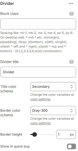
- Block class: The CSS class name for block containers, commonly used for spacing adjustments. Refer to the settings Blocks → Overview → General Settings
- Divider title: Text displayed above the divider line (e.g., “Details”, “Specifications”).
- Title color schema: Color of the divider title text, also chosen from Theme Settings → Basic Settings → Colors.
- Border color schema: Color of the divider line, selected from Theme Settings → Basic Settings → Colors.
- Border height: Border weight.
- Show in quick buy: Display this collapsible block inside the quick-buy modal.
Dynamic Source
Specially used to call display product metafields. For example: Five major advantages, briefly describe.
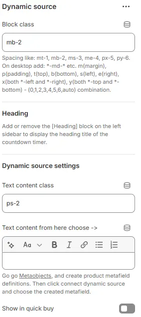
- Block class: The CSS class name for block containers, commonly used for spacing adjustments. Refer to the settings Blocks → Overview → General Settings
Heading: The collapsible tab’s title. Add a child Heading block to display it. Omit the child block if no title is needed. - Text content class: Text content class is often used for spacing adjustment.
- Text content from here choose ->: Connect to product metafield via database icon
- Show in quick buy: Display this collapsible block inside the quick-buy modal.
Feature Rating
Visual skill/feature rating bars.
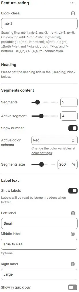
- Block class: The CSS class name for block containers, commonly used for spacing adjustments. Refer to the settings Blocks → Overview → General Settings
Heading: The collapsible tab’s title. Add a child Heading block to display it. Omit the child block if no title is needed.
Segments Content
- Segments: Total number of segments (e.g., 5 for a 5-star rating scale).
- Active segment: Number of filled/active segments (e.g., 4 out of 5).
- Show number: Toggle visibility of the numeric value (e.g., “4/5”).
- Active color schema: Color for active segments, selected from Theme Settings → Basic Settings → Colors.
- Segments size: Size of each segment as a percentage of default (e.g.,
120%for larger bars).
Label Text
- Show labels: Display text labels on the left, middle, and/or right of the segment bar.
- Left label: Text shown at the start (e.g., “Poor”).
- Middle label: Text shown in the center (e.g., “Average”).
- Right label: Text shown at the end (e.g., “Excellent”).
- Show in quick buy: Display this collapsible block inside the quick-buy modal.
Featured Image
Standalone image with optional heading.
- Block class: The CSS class name for block containers, commonly used for spacing adjustments. Refer to the settings Blocks → Overview → General Settings
- Show in quick buy: Display this collapsible block inside the quick-buy modal.
- Child blocks
- Heading: Title for the featured image. Configuration follows Blocks → Basic Block → Heading.
- Image: Main image display. Settings follow Blocks → Basic Block → Image.
Featured Links
Promotional or informational links.
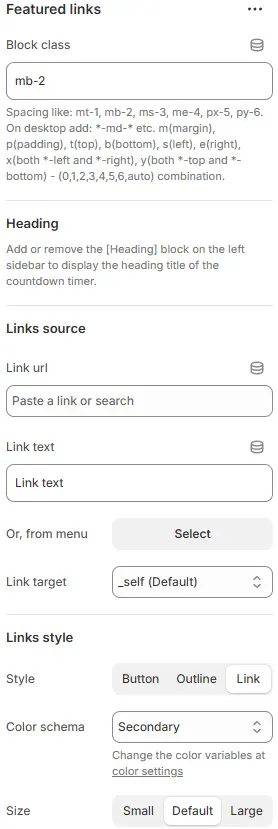
- Block class: The CSS class name for block containers, commonly used for spacing adjustments. Refer to the settings Blocks → Overview → General Settings
Heading: The collapsible tab’s title. Add a child Heading block to display it. Omit the child block if no title is needed.
Links Source
- Link url: Enter or select the destination URL for a single link.
- Link text: The visible label or text of the link (e.g., “Learn More”).
- Or, from menu: Alternatively, select a Shopify menu (from Content > Menus) to automatically display multiple links.
- Link target: Specify how the link opens:
_blank– New tab/window_self– Same tab (default)_parent– Parent frame_top– Top-level browsing context
Links Style
-
Style: Visual appearance—
button,outline, orlink. -
Color schema: Text/button color selected from Theme Settings → Basic Settings → Colors.
-
Size: Button size (
small,default,large)—only applies when Style isbuttonoroutline. -
Show in quick buy: Display this collapsible block inside the quick-buy modal.
Inventory Level
Real-time stock indicator.
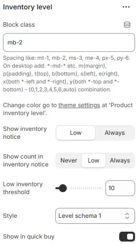
- Block class: The CSS class name for block containers, commonly used for spacing adjustments. Refer to the settings Blocks → Overview → General Settings
- Show inventory notice: Condition for displaying the inventory status message—choose
Low(only when stock is below threshold) orAlways(show for all stock levels). - Show count in inventory notice: Whether to display the actual quantity:
Never: Hide the numberLow: Show only when stock is lowAlways: Always show the count
- Low inventory threshold: The stock level below which a product is considered “low” (e.g.,
5means “Low stock” appears when ≤5 units remain). - Style: Visual styling for the inventory notice, selected from Theme Settings → Style scheme settings → Inventory Level Style Schema.
- Show in quick buy: Display this collapsible block inside the quick-buy modal.
Payment Icons
Display accepted payment methods.
- Block class: The CSS class name for block containers, commonly used for spacing adjustments. Refer to the settings Blocks → Overview → General Settings
Heading: The collapsible tab’s title. Add a child Heading block to display it. Omit the child block if no title is needed. - Payment icons: Settings from Blocks → Basic Block → Payment Icons
- Show in quick buy: Display this collapsible block inside the quick-buy modal.
Pop-up (Modal)
Trigger a modal window.
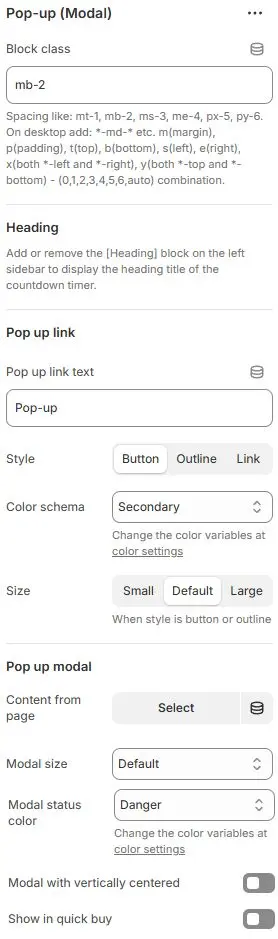
- Block class: The CSS class name for block containers, commonly used for spacing adjustments. Refer to the settings Blocks → Overview → General Settings
Heading: The collapsible tab’s title. Add a child Heading block to display it. Omit the child block if no title is needed.
Pop up Link
- Pop up link text: Label text for the button that triggers the modal (e.g., “View Details”, “Size Guide”).
- Style: Button appearance—
button(solid),outline(hollow), orlink(text-only). - Color schema: Button color selected from Theme Settings → Basic Settings → Colors.
- Size: Button size—
small,default, orlarge(only applies when Style isbuttonoroutline).
Pop up Modal
- Content from page: Select a Shopify page whose content will be displayed inside the modal.
- Modal size: Choose from
Small,Default,Large,Extra large, orFullscreen. - Modal status color: Accent color for the modal’s top border or status indicator, chosen from Theme Settings → Basic Settings → Colors.
- Modal with vertically centered: Toggle whether the modal is centered vertically in the viewport.
- Show in quick buy: Display this collapsible block inside the quick-buy modal.
Reviews Stars
Aggregate customer ratings.
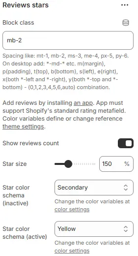
- Block class: The CSS class name for block containers, commonly used for spacing adjustments. Refer to the settings Blocks → Overview → General Settings
- Show reviews count: Toggle visibility of the total number of customer reviews (e.g., “(42 reviews)”).
- Star size: Size of the rating stars as a percentage of the default (e.g.,
100%,120%). - Star color schema (inactive): Color for unselected stars, chosen from Theme Settings → Basic Settings → Colors.
- Star color schema (active): Color for filled/selected stars, also selected from Theme Settings → Basic Settings → Colors.
⚠️ Note: To display reviews and ratings, you must install a third-party reviews app from the Shopify App Store. The app must support Shopify’s standard rating metafield (
ratingandreview_count) to ensure compatibility with this block. Color variables referenced here are defined in your theme’s global color settings.
Richtext
Custom rich-text content.
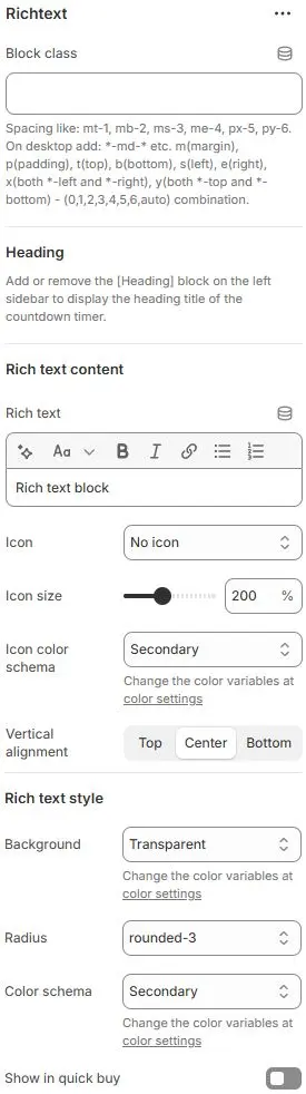
- Block class: The CSS class name for block containers, commonly used for spacing adjustments. Refer to the settings Blocks → Overview → General Settings
Heading: The collapsible tab’s title. Add a child Heading block to display it. Omit the child block if no title is needed.
Rich Text Content
- Rich text: Enter your custom content using the rich text editor (supports headings, lists, links, etc.).
- Icon: Choose an icon to display alongside the text, or select No icon.
- Icon size: Icon size as a percentage of default (e.g.,
100%,120%). - Icon color schema: Icon color selected from Theme Settings → Basic Settings → Colors.
- Vertical alignment: Vertical positioning of the icon relative to the text—
Top,Center, orBottom.
Rich Text Style
- Background: Background color of the rich text container, chosen from Theme Settings → Basic Settings → Colors.
- Radius: Corner style—
rounded1torounded5,circle, orpill. - Color schema: Text color, also selected from Theme Settings → Basic Settings → Colors.
- Show in quick buy: Display this collapsible block inside the quick-buy modal.
Sharing
Social sharing buttons.
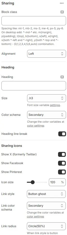
- Block class: The CSS class name for block containers, commonly used for spacing adjustments. Refer to the settings Blocks → Overview → General Settings
Heading
- Heading: Optional title above the sharing icons (e.g., “Share this”, “Tell your friends”).
- Size: Font size utility for the heading text.
- Color schema: Color theme for the heading text.
- Heading line break: Toggle whether the heading text wraps to a new line (useful for long titles or responsive layouts).
Sharing Icons
- Show X (formerly Twitter): Display the X (Twitter) social sharing icon.
- Show Facebook: Toggles visibility of the Facebook share button.
- Show Pinterest: Toggles visibility of the Pinterest save/share button.
- Icon size: Scales the social icons relative to default.
- Link style: Visual treatment of each sharing link/button.
- Link color schema: Color theme for the links/icons.
- Link radius: Corner rounding for buttons when
Link styleis set to button variants.
SKU
Display product SKU.
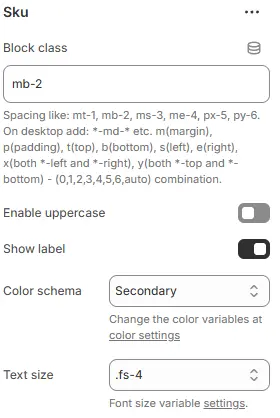
- Block class: The CSS class name for block containers, commonly used for spacing adjustments. Refer to the settings Blocks → Overview → General Settings
- Enable uppercase: Toggles whether the SKU text is displayed in all capital letters.
- Show label: Toggles whether a descriptive label (e.g., “SKU:”) precedes the actual SKU value.
- Color schema: Color theme applied to the SKU text (and label, if shown).
- Text size: Font size utility for the SKU text.
Variant Picker
Product option selector.
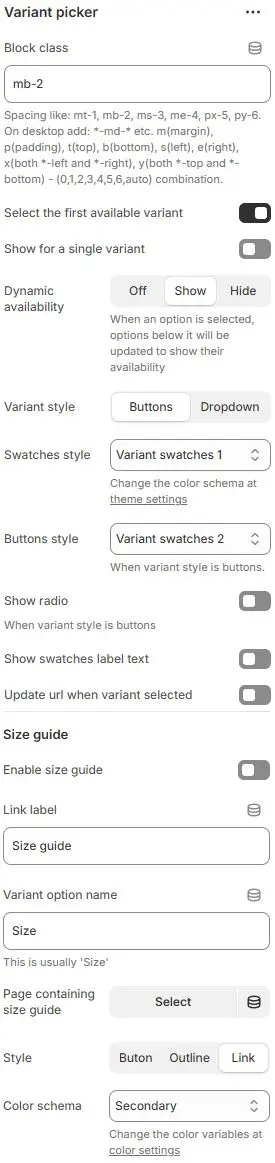
- Block class: The CSS class name for block containers, commonly used for spacing adjustments. Refer to the settings Blocks → Overview → General Settings
- Select the first available variant: Automatically select the first in-stock variant when the page loads.
- Show for a single variant: Display the variant picker even if the product has only one variant.
- Dynamic availability: Update lower-level options based on selection:
Off: Show all options regardless of stockShow: Gray out unavailable optionsHide: Remove unavailable options from the list
- Variant style: Choose how options are presented—
ButtonsorDropdown. - Swatches style: Visual styling for color/size swatches, selected from Theme Settings → Style scheme settings → Variant Swatches Schema.
- Buttons style: Styling for variant buttons (when Variant style = Buttons), also using the Theme Settings → Style scheme settings → Variant Swatches Schema.
- Show radio: Display radio buttons for variant selection (alternative to swatches/buttons).
- Show swatches label text: Show text labels (e.g., “Red”, “XL”) alongside swatch icons.
- Update url when variant selected: Append the selected variant’s ID to the URL (e.g.,
?variant=12345) for direct linking.
Size Guide
- Enable size guide: Toggle visibility of the size guide link/button.
- Link label: Text for the size guide button (e.g., “View Size Chart”).
- Variant option name: The variant option (e.g.,
Size,Taille) this guide applies to. - Page containing size guide: Select a Shopify page that contains your size chart content.
- Style: Button appearance—
button,outline, orlink. - Color schema: Button color selected from Theme Settings → Basic Settings → Colors.
Vendor
Display product vendor name.
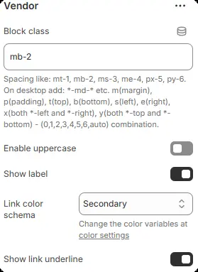
- Block class: The CSS class name for block containers, commonly used for spacing adjustments. Refer to the settings Blocks → Overview → General Settings
- Enable uppercase: Toggles whether the vendor name is displayed in all capital letters.
- Show label: Toggles whether a descriptive label (e.g., “Brand:”, “Vendor:”) precedes the actual vendor name.
- Link color schema: Color theme applied to the vendor text when it’s clickable (i.e., links to vendor collection/page).
- Show link underline: Toggles whether an underline appears beneath the vendor name when it’s a hyperlink.