Header
This section configures the top navigation bar, including logo, cart icon, and currency/language selectors.
Section Settings
Main Settings
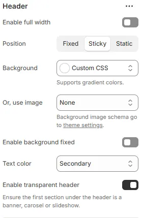
- Enable full width: Expand the header to 100% viewport width.
- Position: CSS positioning—choose
Fixed,Sticky, orStatic. - Background: Set a solid or gradient background color for the entire header.
- Or, use image: Apply a predefined background image style from Theme Settings → Style Schemes → Background Image Schema.
- Text color: Choose text color from theme color variables. Theme Settings → Basic Settings → Colors
- Enable transparent header: Toggle transparent background (ideal for hero banners).
Logos

- Height (Desktop): Logo height on desktop (in
px). - Height (Mobile): Logo height on mobile (in
px). - Text color: Text color for store name (used when no logo is uploaded).
- Text size: Font size for store name.
Navigation
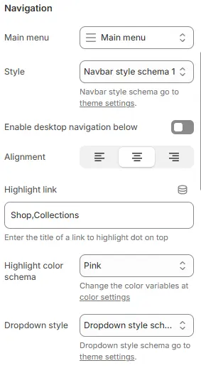
- Main menu: Select the Shopify menu handle to use as the primary navigation.
- Style: Apply a navbar styling scheme from Theme Settings → Style Schemes → Navbar Style Schema.
- Enable desktop navigation below: Move desktop navigation to a second row beneath the logo.
- Alignment: Horizontal alignment of desktop navigation (left, center, right).
- Highlight link: Enter the exact name of a top-level menu item to display a highlight dot.
- Highlight color schema: Color of the highlight indicator.
- Dropdown style: Styling for submenu dropdowns, from Theme Settings → Style Schemes → Dropdown Style Schema.
Shopping icon
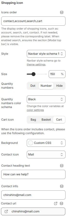
- Icons order:
contact,account,search,cart
Defines the display sequence of shopping icons (e.g., account, search, cart, contact). Remove any label not needed. If “search” is enabled, ensures the [Modal top bar] section remains visible. - Style:
Navbar style schema 1
Applies a predefined navbar visual theme. Additional navbar styling options are managed in global theme settings. - Size:
150%
Controls the scale of the shopping icons relative to their default size. Adjustable via slider or direct input. - Quantity numbers: Options —
Dot,Number,Hide
Determines how item quantities are displayed on cart/account icons: as a dot indicator, numeric badge, or hidden entirely. - Quantity numbers color schema:
Black
Sets the color scheme for quantity badges. Custom colors can be configured under color settings. - Cart icon: Options —
Bag,Basket,Cart
Chooses the visual representation of the cart icon from three preset styles.
💡 When “contact” is included in the Icons order, configure the following contact-related fields:
- Background:
Custom CSS
Allows custom background styling for the contact section using CSS overrides. - Contact icon:
Mail
Selects the icon representing the contact method (e.g., mail, phone, chat). - Contact heading text:
How can we help?
Displayed as the title/header above the contact information field. - Contact info:
chinshiro@mail.com
The primary contact detail shown to users (e.g., email address or phone number). - Contact url:
chinshiro@mail.com
The clickable link associated with the contact info — typically amailto:link or external URL. Icon indicates it’s an outbound/editable link.
Mobile navigation
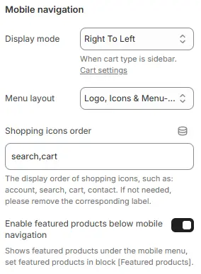
-
Display mode:
Right To LeftOff-canvas mobile menu direction:
--Left To RightRight To LeftTop To BottomBottom To Top
Sets the mobile navigation panel to slide in from the right side of the screen. This setting is relevant when the cart type is configured as a sidebar. Additional cart behavior can be adjusted under Cart settings. -
Menu layout:
Logo, Icons & Menu...— Controls the horizontal arrangement of the three core elements in the mobile navigation bar.Logo, Icons & Menu-icon→ Left: Logo | Right: Icons + Menu buttonMenu-icon & Icons, Logo→ Left: Menu button + Icons | Right: LogoIcons, Logo, Menu-icon→ Left: Icons | Center: Logo | Right: Menu buttonMenu-icon, Logo, Icons→ Left: Menu button | Center: Logo | Right: IconsMenu-icon & Icons, logo, Empty→ Left: Menu button + Icons | Center: Logo | Right: EmptyEmpty, logo, Icons & Menu-icon→ Left: Empty | Center: Logo | Right: Icons + Menu button
Defines the structure of the mobile navigation menu — typically including the site logo, shopping icons (e.g., search, cart), and the main menu links. The ellipsis (...) suggests additional customizable elements may be available.
-
Shopping icons order:
search,cart
Specifies the display sequence of shopping-related icons in the mobile nav bar. Only “search” and “cart” are enabled here; other options like “account” or “contact” have been removed per user preference. If an icon is not needed, its label should be deleted from this field. -
Enable featured products below mobile navigation:
Off(toggle switched off)
When enabled, this option displays a section of featured products directly beneath the mobile navigation menu. To use this feature, you must first configure which products to show via the block named [Featured products]. Currently disabled.
Social Media Icons
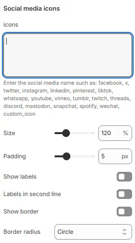
- Icons: Enter social platform codes (comma-separated). Supported:
facebook, x, twitter, instagram, linkedin, pinterest, tiktok, whatsapp,
youtube, vimeo, tumblr, twitch, threads, discord, mastodon, snapchat, spotify, wechat, custom_icon - Size: Icon size (in
pxor relative units). - Padding: Internal spacing around each icon (in
px). - Show labels: Display platform names below icons.
- Labels in second line: Force labels to appear on a new line.
- Show border: Add a border around each icon+label group.
- Border radius: Corner roundness of the border.
- Border padding: Spacing between border and inner content (in
px).
Country/Currency/Language
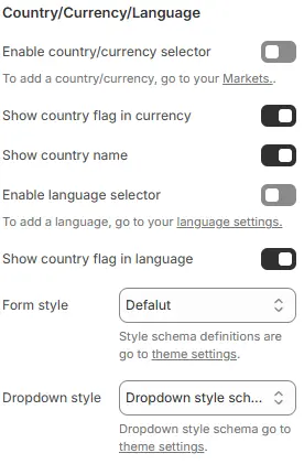
- Enable country/currency selector: Show currency switcher.
- Show country flag in currency: Display flags in currency dropdown.
- Show country name: Show country names alongside currencies.
- Enable language selector: Show language switcher.
- Show country flag in language: Display flags in language dropdown.
- Form style: Apply styling from Theme Settings → Style Schemes → Form Style Schema.
- Dropdown style: Dropdown menu style from Theme Settings → Style Schemes → Dropdown Style Schema.
Blocks
The Header Block primarily consists of two components: Mega Navigation and Featured Products.
- Mega Navigation: Used to configure the dropdown mega menu.
- Featured Products: Used to configure the display of recommended products below the mobile menu.
1. Mega Navigation
Create expansive dropdown menus for top-level navigation items.
Main Settings
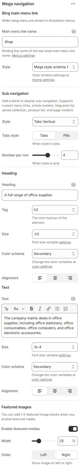
Bing main menu link
Wide mega menu are shown in dropdown menus.
- Main menu link name: Enter the exact name of a top-level menu item (case-sensitive). Hovering over this item triggers the Mega menu.
- Style: Apply a Mega menu styling scheme from Theme Settings → Style Schemes → Mega Style Schema.
Sub navigation
Add a block to display sub navigation. Supports custom menu links, article content, blog post list, series collection, product list, and page content.
- Style: Layout type—
tabs-horizontal,tabs-vertical, orgrid - Tabs style:
nav-tabs(standard) ornav-pills(capsule) - Number per row: Number of items displayed per row in grid layout. (Visible when Style = Grid) Range: e.g., 1–6 Default:
4
Heading
- Heading: Main heading text for the mega menu section. Example:
A full range of office supplies - Tag: The HTML markup tag for the element. Options:
h1,h2,h3,h4,h5,h6,div. - Size: Font size variable settings. Options:
.h1-.h6,.fs-1-.fs-6,display-1-display-6. Theme Settings → Basic settings - Color scheme: Text color from theme variables. Change the color variables at color settings.
- Alignment: Horizontal alignment of the heading. Options: Left | Center | Right
Text
- Text: description below heading
- Size: Font size from typography variables. Options:
.h1-.h6,.fs-1-.fs-6,display-1-display-6. Theme Settings → Basic settings - Color scheme:Text color from theme variables. Change the color variables at color settings.
- Alignment: Horizontal alignment of the heading. Options: Left | Center | Right
Featured images
You can add 1-2 featured image blocks when you enable featured media.
- Enable featured medias: Enable/disable display of featured images.
- Width: Width of the featured image relative to container. Range: 0% – 100%
- Order: Show image on left or right side of content. Options:
Left|Right
Supported Child Blocks
All child blocks share common settings:
- Heading: Tab or grid title
- Tag: HTML tag for heading
- Url: Link destination
Specific block types:

Mega products
Displays product cards. Settings follow Blocks → Specific Block → Product Cards.
Mega article
Renders a single blog article. Select from your published posts.
Mega blog
Shows recent articles from a selected blog.
- Limit of article: Max number of posts
- Card style: From Cards Style Schema
- Per row: Columns per row
- Full settings: Blocks → Specific Block → Blog Posts Cards
Mega collection
Displays a product collection. Configure via Blocks → Specific Block → List Collections Content.
Mega menu link
Pulls structure from a Shopify admin → Content → Menus.
Mega page
Embeds content from a selected page.
Featured image
Custom media + content block.

- Card schema: The featured image is displayed within a card container. Select a card styling preset from your Cards Style Schema (defined in Theme Settings → Style Schemes → Cards Style Schema).
- Image: Configure the image using the same settings as the Blocks → Basic Block → Image (e.g., cropping, ratio, mobile override, link).
- Heading: Customize the title using the same parameters as the Blocks → Basic Block → Heading (e.g., tag, size, color, alignment, icon).
- Text: Add and style rich text content using the same options as the Blocks → Basic Block → Text.
- Button: Add a call-to-action button with settings matching the Blocks → Basic Block → Button (e.g., label, URL, style, color, size).
2. Featured Products
A static block that appears below the mobile off-canvas menu.
- Configuration follows Blocks → Function Block → Featured Products.
- Can be hidden if not needed.