Blog Posts Cards
A block for displaying blog post cards—either as a single featured article or as part of a blog list/grid. Commonly used in blog index pages, sidebar highlights, or “Recommended Articles” sections.
Blog Posts Cards Settings

- Blog post:
Select a specific blog post to display as a single card.
→ Leave blank when used inside blog list or recommended posts blocks (the system will auto-populate posts from the selected blog).
Cards Layout
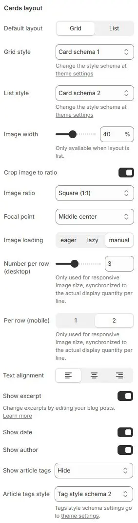
- Default layout: Choose between
Grid(multi-column) orList(single-column with image left/right). - Grid style: Apply a card styling preset for grid view.
→ Defined in Theme Settings → Style scheme settings → Cards Style Schema - List style: Apply a card styling preset for list view.
→ Same source as above - Image width: (List layout only) Width of the featured image as a percentage of the card.
- Crop image to ratio: Enable forced aspect ratio cropping for consistent visuals.
- Image ratio: Select target ratio (e.g.,
16:9,1:1,4:5,3:2, etc.).- Auto
- Custom (3:1)
- Ultrawide (21:9)
- Double-width (2:1)
- Widescreen / HD (16:9)
- Classic / DSLR (3:2)
- ISO Paper (1.4:1)
- Standard Definition/SD (4:3)
- Landscape (5:4)
- Square (1:1)
- Instagram Portrait (4:5)
- Portrait (3:4)
- Pinterest Pin (2:3)
- Portrait (9:16)
- Focal point: Control which part of the image is preserved during cropping (e.g.,
Top left,Top center,Top right,Middle left,Middle center,Middle right,Bottom left,Bottom center,Bottom right). - Image loading: Choose loading behavior:
eager– Load immediatelylazy– Load when near viewport (recommended)manual– Controlled via JavaScript
- Number per row (desktop): Only used for responsive image size, synchronized to the actual display quantity per line.
- Per row (mobile): Only used for responsive image size, synchronized to the actual display quantity per line.
- Text alignment: Align all text content (title, excerpt, meta) to left, center, or right.
- Show excerpt: Display the article’s excerpt or summary.
- Show date: Show the publication date.
- Show author: Display the author name (if assigned in Shopify admin).
- Show article tags: Render the post’s assigned tags.
- Article tags style: Apply a tag styling scheme.
→ Defined in Theme Settings → Style scheme settings → Tags Style Schema
Overlay style
When the card layout is grid, enable overlay styles for blog images that conform to the overlay ratio.
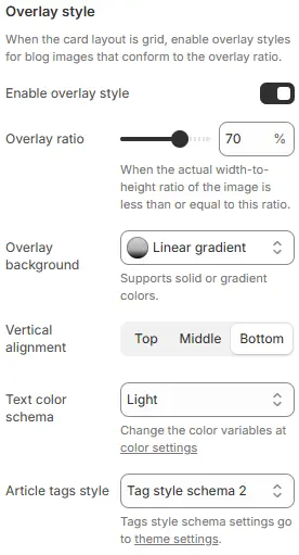
- Enable overlay style: Toggle to activate or deactivate the overlay effect on blog images when using grid layout.
- Overlay ratio: Slider control to define the maximum width-to-height ratio at which the overlay will be applied.
- When the actual width-to-height ratio of the image is less than or equal to this ratio.
- Overlay background: Defines the visual fill behind overlaid content (e.g., title, tags).
- Vertical alignment: Controls vertical positioning of overlay content within the image container.
Top|Middle|Bottom
- Text color schema: Determines the color palette used for overlay text (title, metadata, etc.).
- Article tags style: Applies a predefined tag styling scheme to article/category labels displayed in the overlay.
Animations on Scroll
- Enable entrance animations as block enter the viewport.
- Configuration follows the standard Animations on Scroll settings.
- See: Blocks → Overview → Animations on scroll