List Collections Content
The List Collections Content block displays a grid of collections. It is used in Collections list templates or within composite blocks that require a collection listing. It supports one child block: Collection block.
Settings
List Collections Content
- List collections class: Custom CSS class for the collection list container (commonly used for spacing adjustments). For usage guidance, see: Blocks → Overview → General Settings.
Collection List
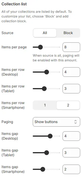
- Source: Where collections are pulled from:
All: Fetches all published collections from Shopify Admin → Products → Collections with pagination.Block: Manually select specific collections via the child Collection block.
- Items per page → Sets how many collection items appear on each paginated page (when Source = All).
- Items per row (Desktop) → Controls horizontal layout density on desktop screens.
- Items per row (Tablet) → Layout density for tablet-sized viewports.
- Items per row (Smartphone) → Layout density for mobile devices.
- Paging: Pagination method—
Infinite scrollorShow buttons.- Infinite scroll: Automatically load the next page when scrolling
- Show buttons: Display pagination button
- Items gap (Desktop) → Horizontal & vertical spacing between collection cards on desktop.
- Items gap (Tablet) → Spacing between items on tablet breakpoints.
- Items gap (Smartphone) → Spacing between items on mobile devices.
Collection Cards
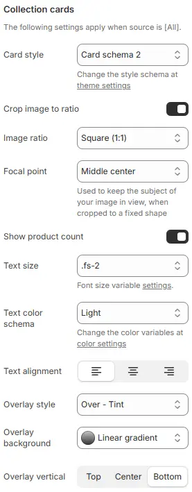
- Card style: Visual preset for collection cards, defined in Theme Settings → Style scheme settings → Cards Style Schema.
- Crop image to ratio: Enable image cropping to a specific aspect ratio.
- Image ratio: Choose from preset ratios (e.g.,
16:9,1:1,3:4,21:9, etc.).Auto,Custom (3:1),Ultrawide (21:9),Double-width (2:1),Widescreen / HD (16:9),Classic / DSLR (3:2),ISO Paper (1.4:1),Standard Definition/SD (4:3),Landscape (5:4),Square (1:1),Instagram Portrait (4:5),Portrait (3:4),Pinterest Pin (2:3),Portrait (9:16)
- Focal point: Control which part of the image is preserved during cropping (
Top,Center,Bottom, etc.). - Show product count: Display the number of products in each collection.
- Text size: Font size for collection title.
- Text alignment: Horizontal alignment of the title (
left,center,right). - Overlay style: Text positioning and background treatment:
Text below: Title appears under the image (no overlay).Over - Tint: Title floats over image with a semi-transparent dark tint.Over - Box: Title floats over image with a light background behind text only.Over - Text shadow: Title floats with a text shadow for contrast (no background).Over - Text shadow and tint: Combines text shadow and image tint.Over - No background: Title floats directly on image with no enhancements.
- Overlay background: Background fill type for the text overlay area.
- Overlay vertical: Vertical positioning of the text overlay relative to the card image.
- Options:
Top|Center| `Bottom
- Options:
Animations on Scroll
- Enable entrance animations as block enter the viewport.
- Configuration follows the standard Animations on Scroll settings.
- See: Blocks → Overview → Animations on scroll
Child Block: Collection Block
Used when Source = Block to manually define which collections appear.
Block Content
- Collection: Select a specific collection from your Shopify admin.
- Image: Override the collection’s default image (optional).
- Subheading: Add a secondary line of text below the title.
- Button label: Custom label for the “View collection” button (e.g., “Shop Now”).
Block Cards
- All styling parameters (image ratio, overlay, text size, button style, etc.) follow the same settings as the parent Collection Cards section above.
Animations on Scroll
- Enable entrance animations as block enter the viewport.
- Configuration follows the standard Animations on Scroll settings.
- See: Blocks → Overview → Animations on scroll