3D Model With Text
The 3D Model With Text block displays an interactive 3D model alongside descriptive content (heading, text, and button). Ideal for showcasing products with rich visual context.
Settings
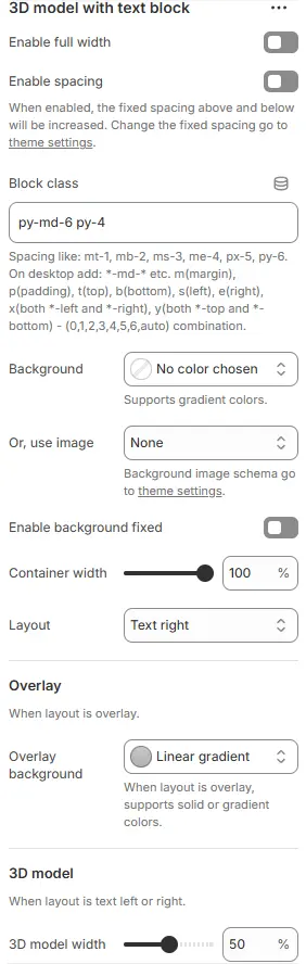
- Enable full width: Expand the block to 100% viewport width. See: Blocks → Overview → General Settings
- Enable spacing: Adds fixed vertical padding/margin above and below the section to visually separate it from adjacent content.
- When enabled: Spacing values are controlled via theme settings — useful for breathing room in dense layouts.
- Block class: Custom CSS class for spacing or layout overrides.
- Background: Set a solid or gradient background color.
- Or, use image: Apply a background image using a preset from Theme Settings → Style scheme settings → Background Image Schema.
All settings above follow: Blocks → Overview → General Settings
- Container width: Width of the entire block container as a percentage (e.g.,
90%,100%). - Layout: Arrangement of model and text:
Overlay: Text appears over the 3D modelText left: Text on the left, model on the rightText right: Text on the right, model on the left
- Overlay background: Set background when layout is overlay, supports solid or gradient colors.
- 3D model width: Width of the 3D model area as a percentage of the container.
Child Blocks
- 3D model: Static block of embed a 3D model (GLB/GLTF). Settings follow Blocks → Basic Block → 3D Model.
The following are blocks that can be freely added or removed:

- Button: Add a call-to-action link or button. Settings follow Blocks → Basic Block → Button.
- Collapsible tab: Create expandable/collapsible content sections for organized information display. Settings follow Blocks → Basic Block → Collapsible Tab.
- Countdown timer: Display a live countdown to promotions, launches, or deadlines. Settings follow Blocks → Basic Block → Countdown Timer.
- Discount code: Show and apply promotional codes directly on the page. Settings follow Blocks → Basic Block → Discount Code.
- Heading: Add a title above or beside the model. Settings follow Blocks → Basic Block → Heading.
- Navigation: Insert menu links or site navigation elements. Settings follow Blocks → Basic Block → Navigation.
- Newsletter form: Embed email subscription forms to grow your mailing list. Settings follow Blocks → Basic Block → Newsletter Form.
- Payment icons: Display accepted payment method logos for trust and clarity. Settings follow Blocks → Basic Block → Payment Icons.
- Social media icons: Link to social profiles with branded icon buttons. Settings follow Blocks → Basic Block → Social Media Icons.
- Stars: Show rating stars (e.g., product reviews) visually. Settings follow Blocks → Basic Block → Stars.
- Steps segments: Break down processes into numbered or labeled steps. Settings follow Blocks → Basic Block → Steps Segments.
- Text: Include rich-text description content. Settings follow Blocks → Basic Block → Text.