Slide or Grid
A block used for initial setup of the spinner carousel effect or grid layout.
Slide or Grid Settings
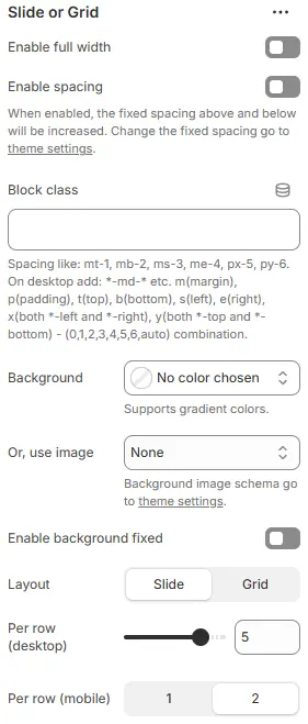
- Enable full width: Toggle to make the block span the entire viewport width, ignoring standard container margins.
- Enable spacing: Activates fixed vertical spacing above and below the block; specific values are managed in global theme settings.
- Block class: Assigns custom CSS utility classes for advanced styling.
- Background: Sets the background style for the entire section.
- Or, use image: Replaces the solid background color with an image.
- Enable background fixed: Locks the background image in place while content scrolls over it (Parallax effect).
- All four settings above follow: Blocks → Overview → General Settings
- Layout: Selects the display mode for the child items.
Slide→ Items appear in a horizontal carousel/slider with navigation arrows.Grid→ Items are displayed statically in rows and columns without sliding.
- Per row (desktop): Defines the number of items displayed per row on large screens.
- Adjustable value (e.g., 1 to 6+); screenshot shows
5.
- Adjustable value (e.g., 1 to 6+); screenshot shows
- Per row (mobile): Defines the number of items displayed per row on small screens.
1→ Single column layout (larger items, better for detailed cards).2→ Dual column layout (compact grid, better for simple lists).
When layout is grid

- Grid gap (desktop): Controls the spacing between grid items on large screens.
- Grid gap (tablet): Sets the spacing between grid items on medium-sized devices (tablets).
- Grid gap (smartphone): Defines the spacing between grid items on smartphone devices.
💡 Note: These settings only appear when "Layout" is set to "Grid". For "Slide" layout, spacing is controlled by slide-specific parameters instead.
When layout is slide
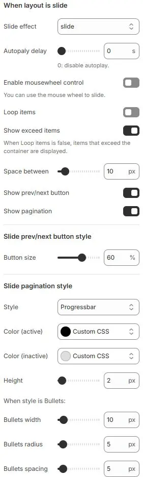
- Slide effect: Defines the transition animation style when sliding between items.
slide→ Standard horizontal sliding transition (default)fade→ Items fade in/out without movementcube→ 3D cube rotation effect between slidescoverflow→ Centered active slide with side items angled outward (like iTunes cover flow)flip→ Horizontal or vertical flip animation between slidescards→ Card-style stacking with depth and perspectivecreative→ Custom or advanced animated transitions (theme-specific)
- Autoplay delay: Sets time interval (in seconds) before automatically advancing to next slide.
0 s→ Autoplay disabled (manual navigation only).>0 s→ Enables automatic cycling; e.g.,5= advances every 5 seconds.
- Enable mousewheel control: Allows users to navigate slides using mouse scroll wheel.
- Loop items: Enables infinite looping — last item connects back to first.
- Show exceed items: Displays partially visible items beyond container edge when Loop is off.
- Space between: Horizontal gap between adjacent slides in pixels.
- Show prev/next button: Toggles visibility of left/right navigation arrows.
- Show pagination: Enables/disables dot indicators below slider showing current position.
Slide prev/next button style
- Button size: Scales navigation arrows as percentage of default size.
Slide pagination style
- Style: Chooses pagination indicator type.
Bullets→ Displays pagination as clickable dots or shapes (e.g., circles, squares)Fraction→ Shows current/total slide count (e.g., “3 / 10”)Progressbar→ Linear bar that fills proportionally as you advance through slides (currently selected)
- Color (active): Color of active/current indicator.
- Color (inactive): Color of non-active indicators.
- Height: Thickness of progress bar (when Style = Progressbar).
When style is Bullets: (Only visible if “Style” is set to “Bullets”)
- Bullets width: Width of each bullet point in pixels.
- Bullets radius: Border-radius for rounded corners (makes circles if equal to half width).
- Bullets spacing: Horizontal gap between consecutive bullets.
Child blocks
The supported sub blocks are:

Slide - Image/Text
The block used for adding graphic and text layout is set as follows:
Settings

- Class name: Custom CSS class for spacing or layout overrides.
- Style: Apply a predefined card style scheme when layout is set to Grid. Theme Settings → Style scheme settings → Cards Style Schema
- Text layout: Layout of Text and Images
Over image→ Text/content is overlaid directly on top of the background image (default for hero/slider cards)Above image→ Text appears in a separate block positioned above the imageBelow image→ Text appears in a separate block positioned below the imageLeft of image→ Text is placed to the left side of the image (horizontal layout)Right of image→ Text is placed to the right side of the image (horizontal layout)No image→ Hides or removes the image; text displays alone without background visual
- Overlay background: When the Text layout is Over image, set a custom background that supports transparent gradients.
- Horizontal: Horizontal alignment of text
- Vertical: Vertical alignment of text
💡 Tip: When using “Over image” layout, combine with “Overlay background” and appropriate horizontal/vertical alignment to ensure text remains legible and visually balanced across different screen sizes.
Image
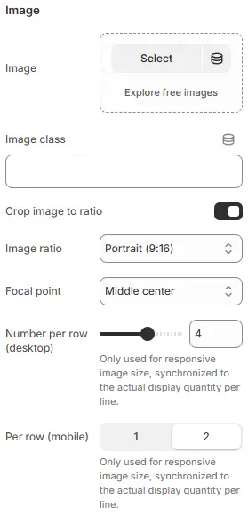
- Image: Upload or choose an image from your media library.
- Image class: Optional CSS class name for custom styling (e.g.,
custom-image-style). - Crop image to ratio: Toggle switch: When enabled, forces the image to be cropped to the specified aspect ratio.
- Image ratio: Aspect ratio applied to image when cropping is enabled.
- Auto
- Custom (3:1)
- Ultrawide (21:9)
- Double-width (2:1)
- Widescreen / HD (16:9)
- Classic / DSLR (3:2)
- ISO Paper (1.4:1)
- Standard Definition/SD (4:3)
- Landscape (5:4)
- Square (1:1)
- Instagram Portrait (4:5)
- Portrait (3:4)
- Pinterest Pin (2:3)
- Portrait (9:16)
- Focal point: Defines which part of the image remains visible during cropping.
(e.g.,
Top left,Top center,Top right,Middle left,Middle center,Middle right,Bottom left,Bottom center,Bottom right) - Number per row (desktop):Only used for responsive image size, synchronized to the actual display quantity per line.
- Per row (mobile): Only used for responsive image size, synchronized to the actual display quantity per line.
Subheading��
The setting for subheading is the same as that for heading block, please refer to the following settings: Blocks → Basic Block → Heading.
Heading
The setting for Heading is the same as that for [Heading] block, please refer to the following settings: Blocks → Basic Block → Heading.
Rich text
The setting for Rich text is the same as that for [Text] block, please refer to the following settings: Blocks → Basic Block → Text.
Button
The setting for Button is the same as that for [Button] block, please refer to the following settings: Blocks → Basic Block → Button.
Slide - blogs
Used to call Block for displaying blog posts.
Settings

- Blog:
Select→ Choose a specific blog or content source to display in this slide. - Limit of articles: Controls the maximum number of blog posts displayed in this slide/carousel/grid.
⚠️ Note: If fewer than 6 articles exist in the selected blog, only available items will be shown.
Child block
The fixed sub block under Slide - blogs: Blog posts cards, mainly used to independently set the style of blog cards.
Blog posts cards: For detailed settings, please refer to Blocks → Specific Block → Blog Posts Cards.
Slide - products
Used to call and display the product list.
Settings

- Collection:
Select→ Choose a product collection (e.g., “Summer Sale”, “Best Sellers”, “New Arrivals”) to display in this slide. - Or, product list:
Select→ Alternatively, choose a manually curated or dynamically filtered.
⚠️ Note: Only one of “Collection” or “Product List” should be active at a time — they are mutually exclusive sources.
- Limit of product: Controls the maximum number of products displayed in this slide/carousel/grid.
⚠️ Note: If fewer than 6 products exist in the selected collection/list, only available items will be shown.
Child block
Slide products contains a fixed sub block: Product cards, which is mainly used to independently set the style of product cards.
Product cards: For detailed settings, please refer to Blocks → Specific Block → Product Cards.
Slide - testimonial
Used to add content and settings for testimonials.
Settings

- Class name: Optional CSS class for custom styling of the card container.
- Style: Selects the visual design template (e.g.,
Card schema 4). - Text layout: Determines if and where an image/avatar appears relative to the text (e.g.,
No Image).No image→ Text only, no image displayedOver image→ Text overlays on top of the imageAbove image→ Text appears above the imageBelow image→ Text appears below the imageLeft of image→ Text appears to the left of the imageRight of image→ Text appears to the right of the image
- Overlay background: Sets a background color behind text when displayed over an image to improve readability.
- Vertical alignment: Controls the vertical position of content within the card (
Top,Middle, orBottom).
Star

- Stars number: Sets how many stars to display (e.g., 5 = full 5-star rating).
- Size: Adjusts star size as percentage of default (e.g., 150% = larger stars).
- Color schema (inactive): Color for unselected/empty stars (e.g.,
Secondary). - Color schema (active): Color for filled/selected stars (e.g.,
Yellow). - Alignment (desktop/tablet/smartphone): Controls horizontal alignment of stars per device type — left, center, or right.
⚠️ Note: Color schemas link to global theme variables — change them in “color settings” for consistency.
Heading
The setting for Heading is the same as that for [Heading] block, please refer to the following settings: Blocks → Basic Block → Heading.
Rich text
The setting for Rich text is the same as that for [Text] block, please refer to the following settings: Blocks → Basic Block → Text.
User info

- Class name: Optional CSS class for custom styling (e.g.,
mt-3adds top margin). - Alignment (desktop/tablet/smartphone): Controls horizontal alignment of user info content per device — left, center, or right.
Avatar

- Avatar: Upload or select an image (e.g.,
Alex_Chén.webp, 100x100 px). - Or, Abbreviation: Fallback text if no image is used (e.g.,
AC). - Size: Preset dimensions —
Small,Medium,Large. - Shape: Display style —
CircleorPill.NoneRounded 1Rounded 2Rounded 3Rounded 4Rounded 5CirclePill
💡 Tip: Use abbreviation when image isn’t available; shape and size ensure visual consistency across devices.
User Name

- Name: The displayed user name (e.g.,
Alex Chen). - Size: Font size preset using theme variables (e.g.,
.h4= heading level 4).
→ Tip: Adjust via “Font size variable settings” for global consistency. - Color schema: Text color theme (e.g.,
Light,Dark, or custom).
→ Change in “color settings” to match your design system. - Enable gradient: Replace the Color schema with custom colors or gradients.
🎨 Design Note: Gradient and color schema work together — ensure contrast remains accessible when enabled.
User location

- Location: The geographic location displayed for the user (e.g.,
San Francisco, USA). - Size: Font size class from your design system (e.g.,
.fs-5— typically “font size 5”, smaller than headings). - Color schema: Text color theme applied to the location label (e.g.,
Light,Dark, or custom).
🌍 UX Tip: Use concise, recognizable location formats. Consider adding icons (e.g., 📍) for visual clarity if space allows.
Image (optional)
Set the background image for the current block.

- Image: Upload or select an image for display.
- Crop image to ratio: Toggle to enable automatic cropping based on selected aspect ratio.
- Image ratio: Defines the target aspect ratio for cropped image.
- Focal point: Sets the anchor point around which the image is cropped when resizing.
🖼️ Design Tip: Use focal point to ensure key subjects remain visible after cropping — especially important for profile pictures or hero banners.