Column
The Column block is a single-column container used to divide a parent section into multiple columns. It supports all @theme child blocks.
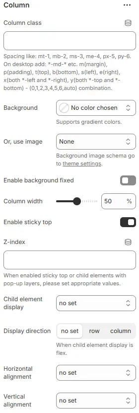
- Column class: Custom CSS class applied to the column container. For usage, see: Blocks → Overview → General Settings.
- Background: Sets background color for the column.
- Or, use image: Optional background image instead of color.
- Enable background fixed: Toggles whether background scrolls with content or stays fixed (parallax effect).
- Column width: Controls horizontal size of the column as a percentage of its parent container.
- Enable sticky top: Makes the column stick to the top of the viewport when scrolling.
- Z-index: Layering order for this column relative to others on the page.
- Child element display: Defines how child elements inside the column are laid out (Flexbox control).
d-block→ Forces children to behave as block-level elements (display: block). Each child starts on a new line and takes full width.d-inline-block→ Children behave as inline-block (display: inline-block). They flow horizontally like text but can have width/height/padding/margin.d-flex→ Enables Flexbox layout (display: flex). Children become flex items — allows powerful alignment, distribution, and responsive reordering via other flex controls (direction, justify-content, align-items, etc.).d-inline-flex→ Same asd-flex, but the container itself behaves as an inline element (useful when embedding flexible layouts within text or inline contexts).
- Display direction: Axis along which child elements are arranged (when Flexbox is active).
no set: Inherits default (usually row) ,row(horizontal),column(vertical) : Critical for mobile-first or stacked layouts.
- Horizontal alignment: Aligns child elements horizontally within the column (Flexbox justify-content).
no set→ No explicit justification; inherits default (usuallyflex-start).left→ Equivalent toflex-start→ All children aligned to the left edge.center→ Children centered horizontally within the container.right→ Equivalent toflex-end→ All children aligned to the right edge.between← Selected → Space between items, no space on edges.
- Vertical alignment: Aligns child elements vertically within the column (Flexbox align-items).
top→ Equivalent toflex-start→ Children align to the top edge of the container.center→ Children centered vertically within the container.bottom→ Equivalent toflex-end→ Children align to the bottom edge.stretch← Default if not set → Children stretch to fill the full height of the container (unless they have explicit height/width constraints).