Article Body Text
The Article Body Text block displays the full content of a blog post. It is only available in blog post templates.
Article Body Text
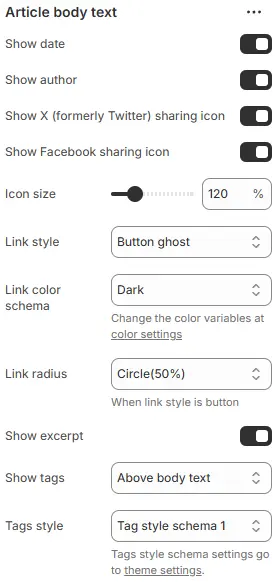
- Show date → Toggle to display the article’s publish/update date.
- Show author → Toggle to display the author’s name.
- Show X (formerly Twitter) sharing icon → Toggle to show X/Twitter share button.
- Show Facebook sharing icon → Toggle to show Facebook share button.
- Icon size → Adjusts scale of social/share icons.
- Link style → Defines visual treatment for links/buttons in article body.
- Link color schema → Sets color theme for links/buttons.
- Link radius → Controls corner rounding when link style is set to “button”.
- Show excerpt → Toggle to display article summary/preview text before full content.
- Show tags → Determines where article tags appear relative to body text.
- Tags style → Applies predefined visual styling to tags. Using a preset from Theme Settings → Style scheme settings → Tags Style Schema.
💡 Design Tip:
For clean editorial layouts, enable “Show excerpt” and “Show tags above body text”, use “Button ghost” + “Circle(50%)” for subtle CTAs, and keep icon size at 100–120% for readability without clutter. Disable social icons unless actively promoting shares.
Prev / Next Link

- Show prev/next link: Display navigation to the previous and next blog posts.
- Style: Visual style—
button,outline, orlink. - Color schema: Text/button color from theme color variables.
- Size: Button size when style is
buttonoroutline—small,default, orlarge.
Article Directory Tree

- Show article directory tree: Generate a table of contents from headings (
<h1>to<h6>) in the article. - Width: Container width as a percentage (e.g.,
25%,30%). - Position: Placement of the directory—
leftorrightsidebar. - Style schema: Card-style container for the directory, using a preset from Theme Settings → Style scheme settings → Cards Style Schema.
Comments
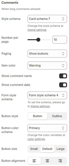
- Style schema: Overall styling for the comments section, using a Theme Settings > Style scheme theme-settings > Cards Style Schema preset.
- Number per page: Maximum number of comments displayed per page.
- Paging: Pagination method—
Infinite scrollorShow buttons.- Infinite scroll: Automatically load the next page when scrolling
- Show buttons: Display pagination button
- Item color: Background or text color for individual comment blocks, selected from theme color variables.
- Show comment name: Display the commenter’s name.
- Show comment date: Show the date the comment was posted.
- Form style schema: Styling for the comment input field, from Theme Settings → Style scheme settings → Form Style Schema.
- Button style: Submit button appearance—
button,outline. - Button color schema: Button color from Theme Settings → Basic Settings → Colors.
- Button size:
small,default, orlarge. - Button alignment: Horizontal alignment of the submit button (left, center, right).