Collapsible Tab
Collapsible Tab
An accordion-style expandable/collapsible block, primarily used for FAQ sections.
Main Settings
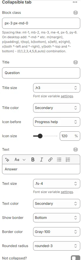
- Block class: Custom CSS class for the container. See: Blocks → Overview → General Settings
- Title: The clickable header text that triggers expansion/collapse of the content panel.
- Title size: Sets font size using theme-defined CSS variable (e.g.,
.h3). Ensures typographic hierarchy and scalability. - Title color: Applies a semantic color token (e.g.,
Secondary) to the title text. Actual hue is managed in theme’s global color settings — enables consistent branding and easy updates. - Icon before: Adds an icon preceding the title to visually indicate interactivity or category.
- Icon size: Controls scale of the preceding icon as percentage of default size.
- Text: The expandable content area beneath the title — supports rich formatting via toolbar:
- Text size: Sets body text font size via theme variable (e.g.,
.fs-4). Balances readability and visual weight relative to title. - Text color: Applies semantic color token (e.g.,
Secondary) to answer text — maintains consistency with title while allowing contrast differentiation if needed. - Show border: Defines where borders appear around the collapsible panel.
Top— adds separator line only above the item, clean for stacked FAQs.Bottom— adds separator line only below the item, clean for stacked FAQs.All— adds separator lines on all four sides (top, bottom, left, and right).None— No separator lines around item.
- Border color: Sets border color using theme token (e.g.,
Gray-100). Subtle grays are common for non-intrusive dividers. - Rounded radius: Controls corner rounding of the entire collapsible card.
rounded-0,rounded-1,rounded-2,rounded-3,rounded-4,rounded-5,rounded-circle,rounded-pill. - Not collapsed?: Toggle to set initial state of the tab.
- If enabled → panel opens by default (useful for highlighting key info).
- If disabled → starts closed (standard for long FAQ lists to reduce clutter).
💡 This component creates accessible, space-efficient accordions perfect for FAQs, feature explanations, or step-by-step guides. Use icons and borders strategically to guide user attention. Ensure sufficient contrast between title/text colors and background. Test keyboard navigation and screen reader compatibility for inclusivity.
Animations on Scroll
- Enable entrance animations as block enter the viewport.
- Configuration follows the standard Animations on Scroll settings.
- See: Blocks → Overview → Animations on scroll