Discount Code
The Discount Code block displays promotional offers with a visible discount rate and a copyable coupon code. It can be added to any section or layout to encourage conversions through limited-time incentives.
Settings
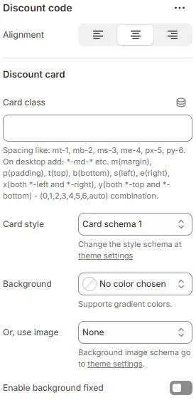
- Alignment: Controls horizontal alignment of the entire discount code section across devices.
- Card class: Custom CSS class for the discount card container (e.g., for spacing or custom styling).
- Card style: Visual preset for the card background, border, and shadow, selected from Theme Settings → Style scheme settings → Cards Style Schema.
- Use background image: Apply a background image to the card using a preset from Theme Settings → Style scheme settings → Background Image Schema.
- Enable background fixed: Toggles whether the background scrolls with content or stays fixed (parallax effect).
💡 This section configures a visually distinct “discount card” component — perfect for highlighting promo codes, limited-time offers, or member-exclusive deals. Use contrasting backgrounds or gradients to make it pop. Pair with centered alignment and generous padding for maximum visibility. Avoid cluttered backgrounds if text legibility is critical.
Discount Rate

- Position: Placement of the discount badge—
left,right. - Show discount amount: Display a fixed monetary discount (e.g., “$10 OFF”).
- Or, show discount percentage: Display a percentage discount (e.g., “20% OFF”).
- Size: Font size of the discount text.
- Color schema: Text and badge color from theme color variables.
Discount Code
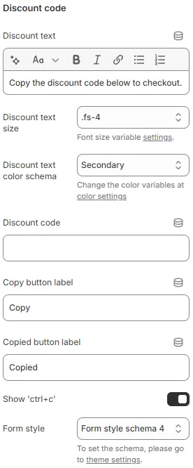
- Discount text: Label above the code (e.g., “Use code:”).
- Discount text size: Font size of the label.
- Discount text color schema: Color of the label text.
- Discount code: The actual promo code (e.g.,
SAVE20). - Copy button label: Text on the copy button (e.g., “Copy”).
- Copied button label: Text shown after successful copy (e.g., “Copied!”).
- Show 'ctrl+c': Display a hint like “Ctrl+C” next to the code for desktop users.
- Form style (discount code box): Styling for the code display field, using a preset from Theme Settings → Style scheme settings → Form Style Schema.
Animations on Scroll
- Enable entrance animations as block enter the viewport.
- Configuration follows the standard Animations on Scroll settings.
- See: Blocks → Overview → Animations on scroll