Stars
A static star rating component for displaying customer review scores. Displays 5 stars by default, with a configurable number of filled (active) stars.
Stars Settings
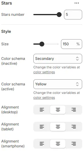
- Stars number:
The number of stars to fill/activate (from 0 to 5). For example,4will light up 4 stars.
Style
- Size: Star size as a percentage of the base font size (e.g.,
100%,125%,150%). - Color schema (inactive): Color of unlit (empty) stars, selected from your theme’s color variables.
→ Defined in Theme Settings → Basic Settings → Colors - Color schema (active): Color of filled (lit) stars, selected from theme color variables.
- Alignment (desktop): Horizontal alignment on desktop (left, center, right).
- Alignment (tablet): Horizontal alignment on tablet devices.
- Alignment (smartphone): Horizontal alignment on smartphone devices.
Animations on Scroll
- Enable entrance animations as block enter the viewport.
- Configuration follows the standard Animations on Scroll settings.
- See: Blocks → Overview → Animations on scroll