Columns Layout
The Columns Layout block enables flexible multi-column arrangements within any standard section. It acts as a container for one or more Column blocks, each of which can hold any other block type (e.g., images, text, product cards, forms), allowing for highly customizable side-by-side content layouts.
Settings
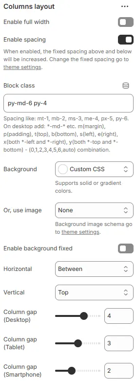
- Enable full width: Expand the block to 100% of the viewport width.
- Enable spacing: Adds fixed vertical margin above and below the block when enabled.
- Block class: Custom CSS class for spacing or layout overrides.
- Background: Set a solid or gradient background color.
- Or, use image: Apply a background image using a preset from Theme Settings → Style scheme settings → Background Image Schema.
- Enable background fixed: Fixes background image during scroll (parallax effect).
All settings above follow: Blocks → Overview → General Settings
- Horizontal alignment: Align the column group—
Left,Center, orRight. - Vertical alignment: Vertical positioning within the container—
Top,Center, orBottom. - Column gap (Desktop): Horizontal space between columns on desktop screens.
- Column gap (Tablet): Gap on tablet-sized screens.
- Column gap (Smartphone): Gap on Smartphone devices.
Child Block
Only one type of child block is supported:
Column
Each Column defines a single vertical content area.
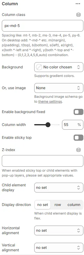
- Column class: Custom CSS class for the column (e.g., for spacing or responsive behavior). Blocks → Overview → General Settings
- Background: Set a solid or gradient background color.
- Or, use image: Apply a background image using a preset from Theme Settings → Style scheme settings → Background Image Schema.
- Enable background fixed: Fixes background image during scroll (parallax effect).
All settings above follow: Blocks → Overview → General Settings
- Column width: Width of the column as a percentage of the container (e.g.,
50%for two equal columns). - Enable sticky top: Keep this column fixed at the top of the viewport while scrolling (ideal for sidebars or persistent content).
- Z-index: Manual z-order control for stacking context (useful with sticky positioning or overlays).
- Child element display: Defines how child elements inside this column are laid out.
no set→ Inherits default display behavior (typicallyblock); no explicit CSSdisplayproperty appliedd-block→ Forces element to behave as a block-level container (full width, new line)d-inline-block→ Element flows inline but retains block properties (width/height/padding respected)d-flex→ Enables Flexbox layout for child elements (horizontal by default)d-inline-flex→ Inline-level flex container — children arranged in flex row/column while flowing with text
- Display direction: When “Child element display” is set to
roworcolumn, controls main axis direction. - Horizontal alignment: Aligns child elements along the main axis (when flex is active).
- Vertical alignment: Aligns child elements along the cross axis (when flex is active).
Child Block
💡 Note: Inside each Column, you can add any block supported by the theme—including headings, images, product cards, forms, videos, and more—enabling complex, magazine-style layouts without code.