Contact Us
The Contact Us block is a ready-to-use section that combines a heading, descriptive text, and a contact form—ideal for dedicated contact pages or footer call-to-action areas.
Settings
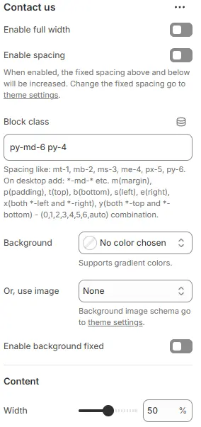
- Enable full width: Expand the block to 100% of the viewport width.
- Enable spacing: Adds fixed vertical margin above and below the block when enabled.
- Block class: Custom CSS class for spacing or layout customization.
- Background: Set a solid or gradient background color.
- Or, use image: Apply a background image using a preset from Theme Settings → Style scheme settings → Background Image Schema.
- Enable background fixed: Fixes background image during scroll (parallax effect).
All settings above follow: Blocks → Overview → General Settings
- Width: Set the maximum width of the content area (e.g.,
100%,800px,70%) to control layout density.
Child Blocks
Heading
Add a block title (e.g., “Get in Touch”). Settings follow Blocks → Basic Block → Heading.
Text
Include a descriptive paragraph (e.g., “We’d love to hear from you!”). Settings follow Blocks → Basic Block → Text.
Contact form
Embed a fully functional contact form. Settings follow Blocks → Basic Block → Contact Form.