Timelines
The Timelines block displays a chronological sequence of events, milestones, or process steps in a visually structured layout. Ideal for brand stories, product development journeys, service workflows, or company history.
Settings
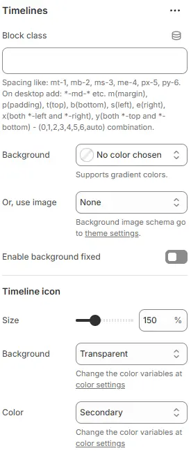
- Block class: Custom CSS class for spacing or layout overrides.
- Background: Set a solid or gradient background color.
- Or, use image: Apply a background image using a preset from Theme Settings → Style scheme settings → Background Image Schema.
- Enable background fixed: Fixes the background image during scroll (parallax effect).
All settings above follow: Blocks → Overview → General Settings
Timeline icon
- Size: Scales icon diameter relative to base size.
- Background: Fill color behind the icon (usually a circle).
- Color: Border/text color of the icon (and possibly connected line).
Child Blocks
A block containing only one Timeline type.
Timeline
Settings
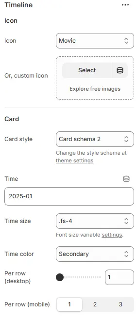
- Icon: Predefined icon from library.
- Or, custom icon: Upload or select a custom image/SVG as the timeline marker.
- Card style: Applies predefined schema for borders, shadows, padding, and background.
- Time: Input field for date/time value.
- Supports formats like
YYYY-MM,MM/DD/YYYY,Q1 2025, or even relative terms like “Last Week”.
- Supports formats like
- Time size: Font size class for the time label.
- Time color: Text color for the time label.
- Per row: The number of media blocks allowed to be added per line displayed.
- Desktop: Number of rows per desktop
- Mobile: Number of rows per mobile device, including tablets and smartphones
Child Blocks
Each sub block contains a fixed Heading block and Text block, as well as Image blocks, 3D models, and Video blocks that can be freely added or removed.
Image
Settings follow Blocks → Basic Block → Stars
Video
Settings follow Blocks → Basic Block → Video.
3D model
Settings follow Blocks → Basic Block → 3D Model.
Heading
Settings follow Blocks → Basic Block → Heading.
Text
Settings follow Blocks → Basic Block → Text.