Faq Collapsible Tabs
The Faq Collapsible Tabs block displays a set of frequently asked questions with collapsible answers. It supports an optional index sidebar for easy navigation and includes a built-in search bar for large FAQ sets.
Settings
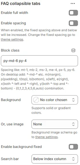
- Enable full width: Expand the block to 100% of the viewport width.
- Enable spacing: Adds fixed vertical spacing (margin) above and below the FAQ block.
- Block class: Custom CSS class for spacing or layout adjustments.
- Background: Set a solid or gradient background color.
- Or, use image: Apply a background image using a preset from Theme Settings → Style scheme settings → Background Image Schema.
- Enable background fixed: Fixes the background image during scroll (parallax effect).
- Search bar: Controls placement of an optional search input field for filtering FAQs.
Below index column→ Search bar appears beneath the FAQ list/index (default for scanning-first UX)Above Collapsible tab column→ Search bar positioned above the collapsible FAQ items — useful for immediate filtering before browsingHide→ Completely hides the search functionality; suitable for small FAQ sets or minimalist designs
Heading
The setting for Heading is the same as that for [Heading] block, please refer to the following settings: Blocks → Basic Block → Heading.
Rich text
The setting for Rich text is the same as that for [Text] block, please refer to the following settings: Blocks → Basic Block → Text.
Index Column
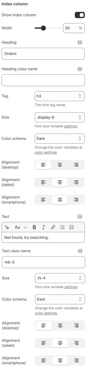
- Show index column: Toggle a sidebar that lists all FAQ headings as clickable links.
- Width: Width of the index column as a percentage (e.g.,
25%). - Heading: Main title displayed at the top of the index column.
- Heading class name: Optional custom CSS class for advanced styling.
- Tag: HTML tag used for the heading element.
- Size: Font size utility class applied to the heading., Using typography variables from Theme Settings → Basic Settings → Typography.
- Color schema: Applies color theme to heading text. Selected from Theme Settings → Basic Settings → Colors.
- Alignment (desktop/tablet/smartphone): Controls horizontal alignment of the heading across devices.
- Text: Optional descriptive or instructional text under the heading.
- Text class name: Custom CSS class for fine-tuning text appearance. Using typography variables from Theme Settings → Basic Settings → Typography.
- Size: Font size utility for the body text.
- Color schema: Color theme for the body text. Selected from Theme Settings → Basic Settings → Colors.
- Alignment (desktop/tablet/smartphone): Horizontal alignment for the body text.
→ Default: Left-aligned on all devices.
Child Blocks
Heading
The question title for each FAQ item. Settings follow Blocks → Basic Block → Heading.
Text
The collapsible answer content (supports rich text). Settings follow Blocks → Basic Block → Text.
FAQ search bar
A live-search input that filters FAQs as users type. Settings follow Blocks → Basic Block → Faq Search Bar.
Collapsible tab
The interactive container that toggles answer visibility (automatically generated per FAQ pair). Settings follow Blocks → Basic Block → Collapsible Tab.