Slideshow
The Slideshow block creates a full-featured carousel banner that supports images, videos, and 3D models as slide content. Ideal for hero banners, promotional campaigns, or immersive storytelling at the top of your homepage or landing pages.
Settings

- Enable full width: Expand the slideshow to 100% of the viewport width.
- Slide effect: Defines the transition animation style when sliding between items.
slide→ Standard horizontal sliding transition (default)fade→ Items fade in/out without movementcube→ 3D cube rotation effect between slidescoverflow→ Centered active slide with side items angled outward (like iTunes cover flow)flip→ Horizontal or vertical flip animation between slidescards→ Card-style stacking with depth and perspectivecreative→ Custom or advanced animated transitions (theme-specific)
- Autoplay delay: Sets time interval (in seconds) before automatically advancing to next slide.
0 s→ Autoplay disabled (manual navigation only).>0 s→ Enables automatic cycling; e.g.,5= advances every 5 seconds.
- Enable mousewheel control: Allow users to navigate slides using the mouse scroll wheel.
- Show prev/next button: Display navigation arrows on the left and right.
- Prev/next button size: Button size as a percentage of default (e.g.,
60%).
Pagination
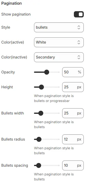
- Show pagination: Toggle visibility of slide indicators.
- Style:
Bullets: Circular dotsFraction: “1 / 5” counterProgressbar: Horizontal progress bar
- Color (active): Color of the current/active indicator.
- Color (inactive): Color of inactive indicators.
- Opacity: Overall opacity of pagination (0–100%).
- Height: Height of the progress bar (for
Progressbarstyle). - Bullets width: Diameter of bullet indicators.
- Bullets radius: Corner roundness (
0= square,50%= circle). - Bullets spacing: Horizontal gap between bullets.
Child Blocks
Supports the following three types of blocks:
- Slide - image: Used to configure settings for image slideshow.
- Slide - 3D model: Used to configure settings for 3D model slideshow.
- Slide - video: Used to configure video slideshow settings.
The three types of blocks have identical common settings and common blocks .
Common settings
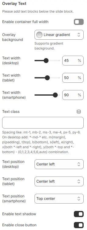
- Enable container full width: Toggles whether the overlay text container spans the full viewport width (ignoring theme’s max-width).
- Overlay background: Sets background color/gradient behind the overlaid text to improve readability against busy images.
- Text Width Desktop: Good for side-by-side layouts; leaves room for imagery. Increase to 60–70% if text-heavy.
- Text Width Tablet: Balanced for mid-sized screens. Consider 55–60% for better readability.
- Text Width Smartphone: Excellent — maximizes usable space while preserving margins. Avoid 100% to prevent edge-touch issues.
- Text class: Applies utility CSS classes for fine-grained margin/padding control around the text block. See: Blocks → Overview → General Settings.
- Text position:Controls vertical/horizontal alignment of text within the overlay area — essential for compositional balance.
Top left,Top center,Top rightCenter left,Center,Center rightBottom left,Bottom center,Bottom right
- Enable text shadow: Adds subtle drop shadow to text for improved contrast against complex backgrounds.
- Enable close button: Displays an “X” or dismiss icon to allow users to hide the overlay (common in modals or temporary banners).
Slide - image
Image
Settings follow Blocks → Basic Block → Image.
Slide - 3D model
3D model
Interactive GLB/GLTF model. Settings follow Blocks → Basic Block → 3D Model.
Slide - video
Video
Video media (MP4, YouTube, Vimeo, etc.). Settings follow Blocks → Basic Block → Video.
Common Blocks
Heading
Overlay title. Settings follow Blocks → Basic Block → Heading.
Text
Overlay description. Settings follow Blocks → Basic Block → Text.
Button
Call-to-action link. Settings follow Blocks → Basic Block → Button.