Multi Column
The Multi Column block creates a responsive grid of content cards, each combining an image, heading, text, and button. Ideal for features, services, testimonials, or product highlights in a clean, structured layout.
Settings
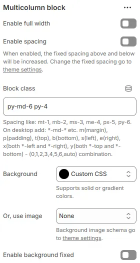
- Enable full width: Expand the block to 100% of the viewport width.
- Enable spacing: Adds fixed vertical spacing (margin) above and below the FAQ block.
- Block class: Custom CSS class for spacing or layout overrides.
- Background: Set a solid or gradient background color.
- Or, use image: Apply a background image using a preset from Theme Settings → Style scheme settings → Background Image Schema.
- Enable background fixed: Fixes the background image during scroll (parallax effect).
All settings above follow: Blocks → Overview → General Settings
Heading
The setting for Heading is the same as that for [Heading] block, please refer to the following settings: Blocks → Basic Block → Heading.
Description
The setting for Rich text is the same as that for [Text] block, please refer to the following settings: Blocks → Basic Block → Text.
Child Blocks
Slide or Grid: Static fixed block, supporting carousel or grid layout.
Slide or Grid
Reference settings: Blocks → Specific Block → Slide or Grid.
Slide - products
Reference settings: Blocks → Specific Block → Slide or Grid → Slide - Image/Text.