Store Messages
The Store Messages block displays a row of informational or promotional messages—such as shipping notices, return policies, or trust badges—with optional icons and links. Ideal for headers, footers, or banners to reinforce key store policies.
Settings
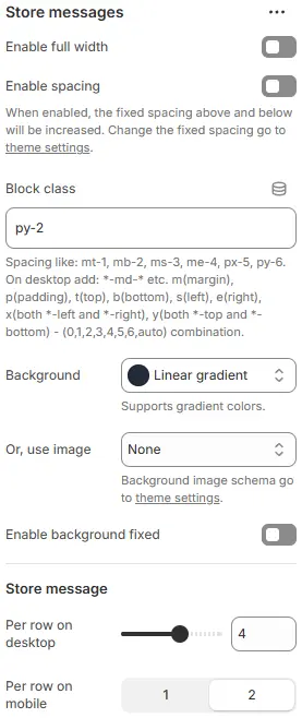
- Enable full width: Expand the block to 100% of the viewport width.
- Enable spacing: Adds fixed vertical spacing (margin) above and below the FAQ block.
- Block class: Custom CSS class for spacing or layout overrides.
- Background: Set a solid or gradient background color.
- Or, use image: Apply a background image using a preset from Theme Settings → Style scheme settings → Background Image Schema.
- Enable background fixed: Fixes the background image during scroll (parallax effect).
All settings above follow: Blocks → Overview → General Settings
Store Message
- Per row on desktop: Number of messages displayed per row on desktop (e.g., 2, 3, 4).
- Per row on mobile: Number of messages per row on mobile (tablet+smartphone) (typically 1 or 2).
Child Block – Store Message
Each individual message item.
Settings
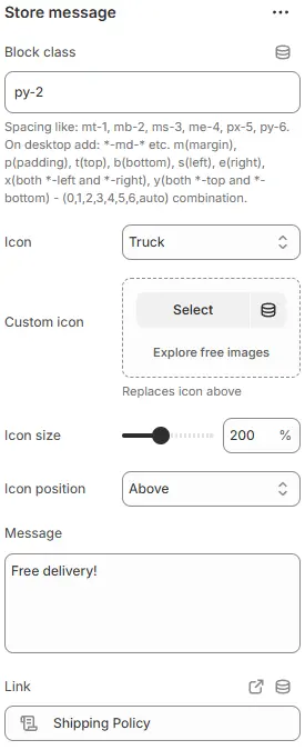
- Block class: CSS class for the message container. Blocks → Overview → General Settings
- Icon: Choose from the built-in icon library.
- Custom icon: Upload a custom SVG or image icon (overrides built-in icon).
- Icon size: Icon size as a percentage or fixed scale.
- Icon position: Placement relative to text—
Before,After,Above, orBelow. - Message: The main text content (e.g., “Free returns within 30 days”).
- Link: Optional URL to make the entire message clickable.
Style

- Text/Link color schema: Text and link color, selected from Theme Settings → Basic Settings → Colors.
- Text size: Font size using typography variables from Theme Settings → Basic Settings → Typography.
- Alignment (desktop): Horizontal alignment on desktop—
Left,Center,Right. - Alignment (mobile): Horizontal alignment on mobile devices (tablet+smartphone).
Animations on Scroll
- Enable entrance animations as block enter the viewport.
- Configuration follows the standard Animations on Scroll settings.
- See: Blocks → Overview → Animations on scroll